Preview image. Unlock full-res
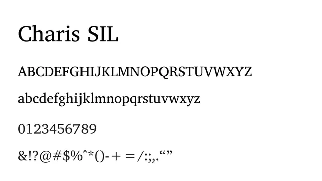
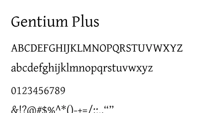
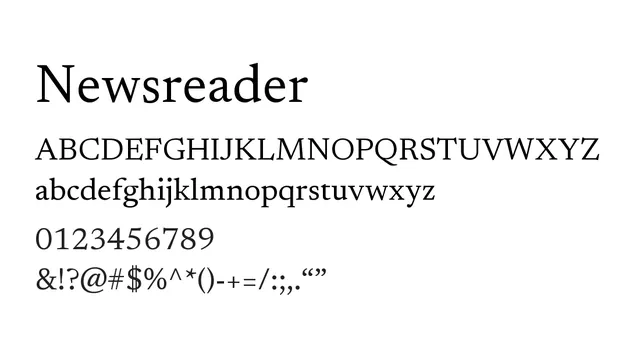
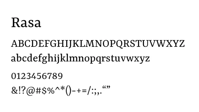
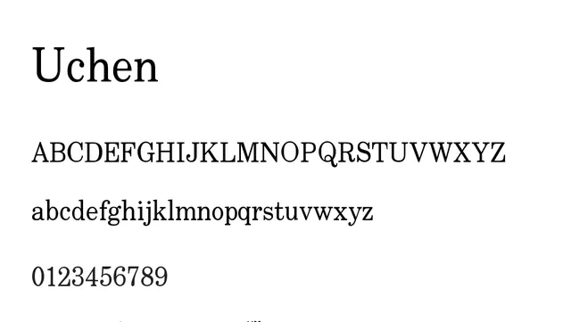
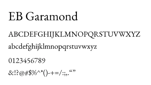
A classical oldstyle serif typeface designed for exceptional readability in text contexts, with traditional serif forms and moderate stroke contrast.
Moodscholarly, traditional, calm
Industryeditorial, publishing, academic, linguistics
Summary
A classical oldstyle serif typeface designed for exceptional readability in text contexts, with traditional serif forms and moderate stroke contrast.
What to use it for
Ideal for body copy in books, academic papers, and editorial layouts. The traditional serif forms and generous spacing support comfortable reading over extended passages.
Pairing
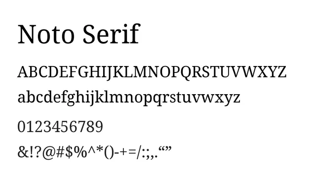
Pairs well with Noto Sans for modern contrast, or use throughout for consistent multilingual typography across multiple scripts.