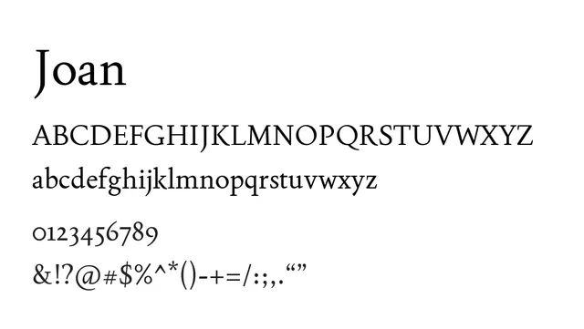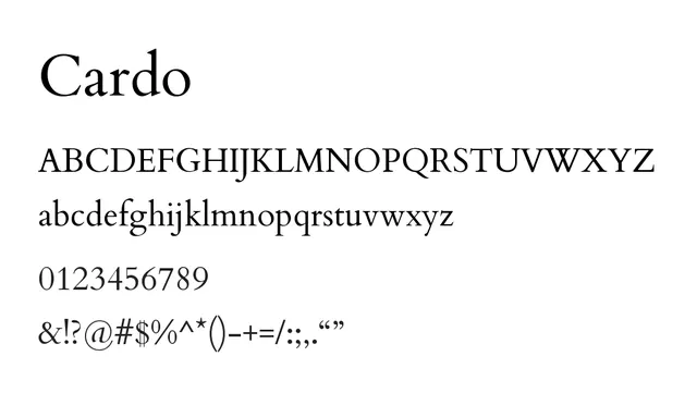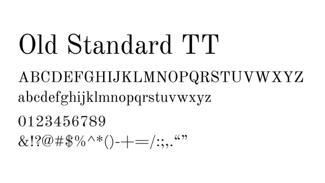
Preview image. Unlock full-res
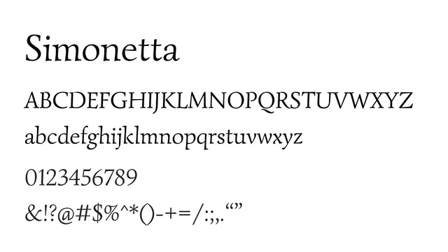
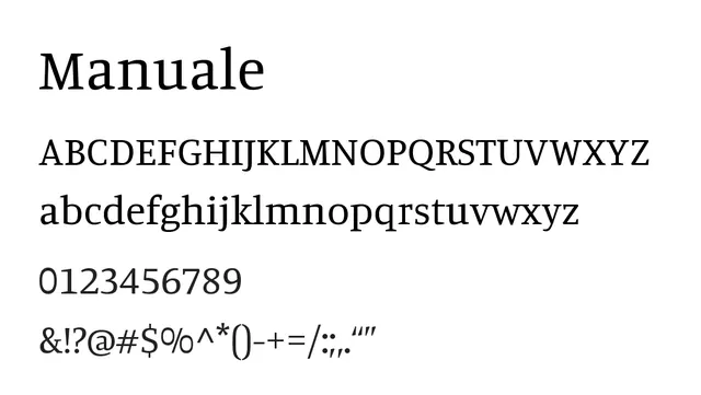
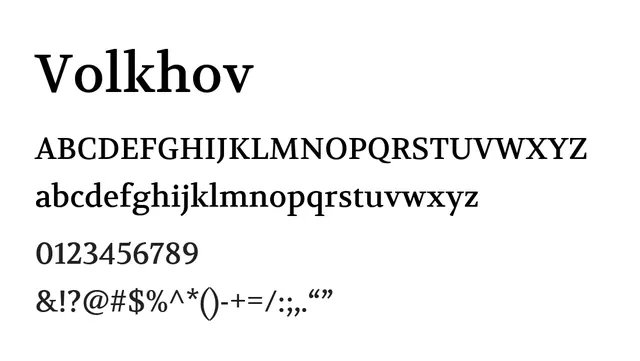
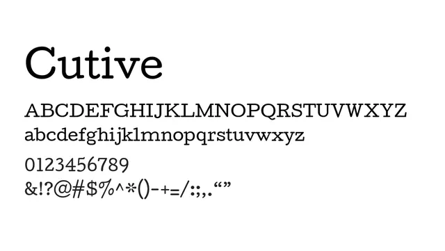
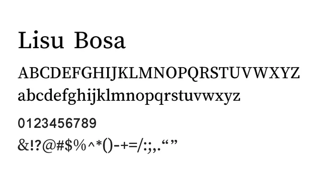
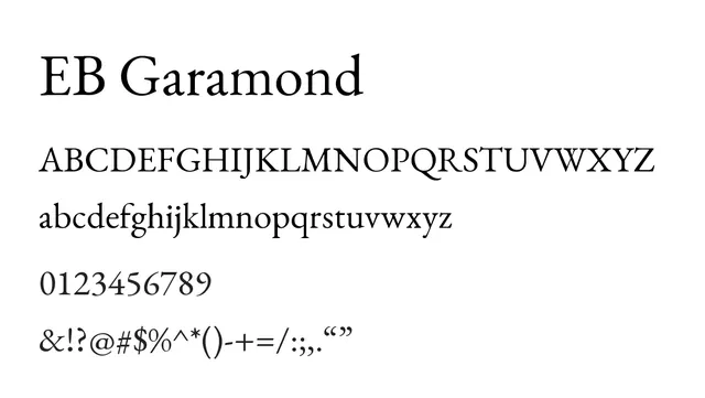
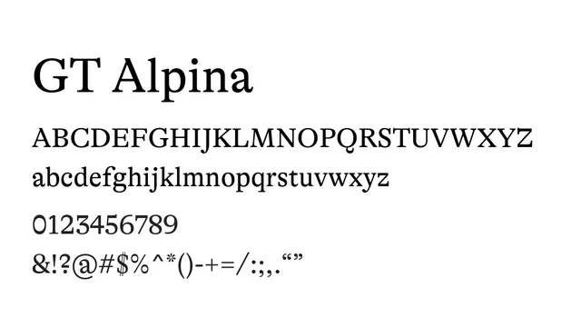
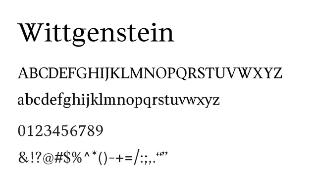
A classical transitional serif with warm proportions and elegant balance, designed for traditional print reading experiences.
Styleclassic, elegant, traditional, refined
Typeserif, transitional
Moodwarm, elegant, timeless, intellectual
Industryeditorial, publishing, academic, luxury, culture
Summary
A classical transitional serif with warm proportions and elegant balance, designed for traditional print reading experiences.
What to use it for
Ideal for editorial design, book typography, and long-form reading. Its timeless elegance and proven readability make it perfect for magazines, publishing, and academic contexts.
Pairing
Pair with a clean neo-grotesque sans like Source Sans Pro for editorial layouts, or use alone for classic print design.