Preview image. Unlock full-res
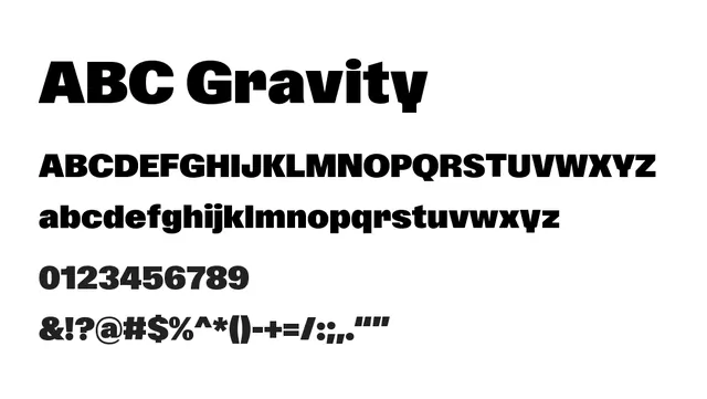
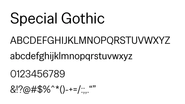
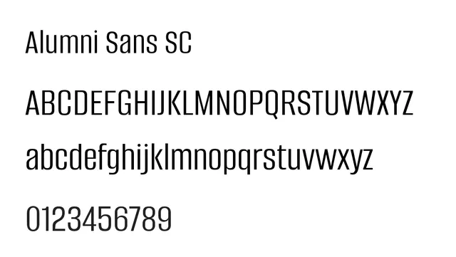
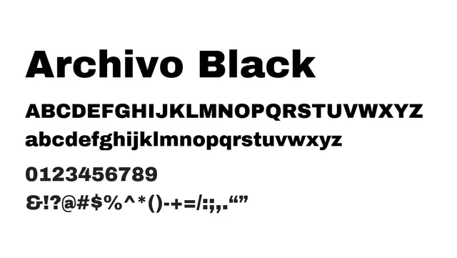
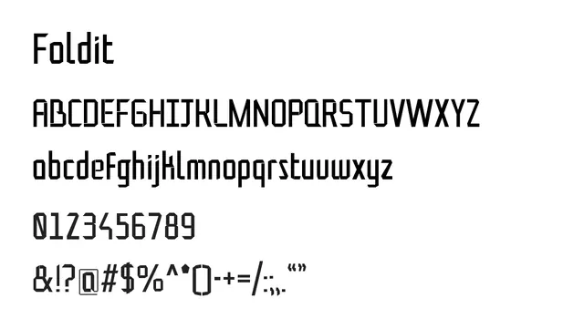
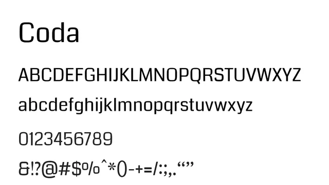
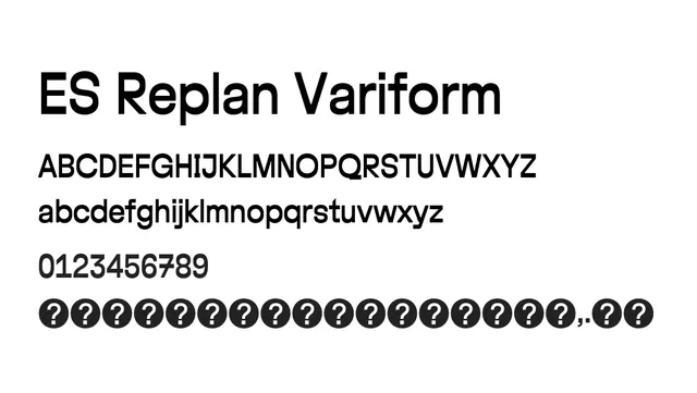
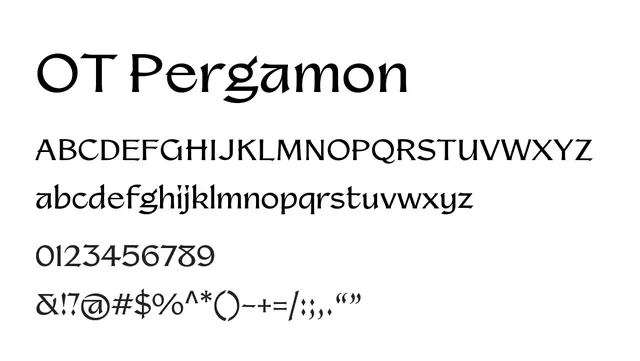
Bold geometric sans-serif with strong terminals and dramatic weight contrast, projecting authority and modernity.
Stylemodern, structured, bold, strong
Typesans-serif, geometric
Moodconfident, authoritative, technical
Summary
Bold geometric sans-serif with strong terminals and dramatic weight contrast, projecting authority and modernity.
What to use it for
Best suited for headlines, UI components, and branding applications. The high contrast makes it less ideal for body text at small sizes, but excellent for display work.
Pairing
Works well paired with light geometric sans like Neue Montreal for headline-body combinations.