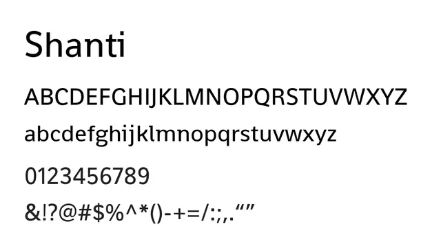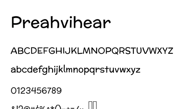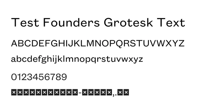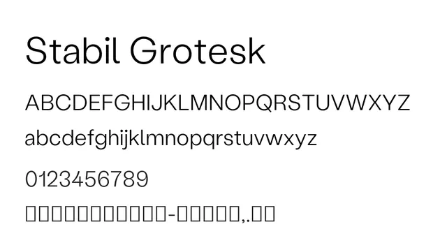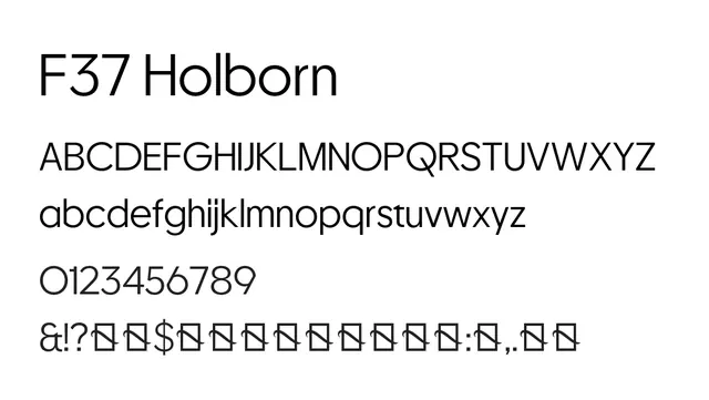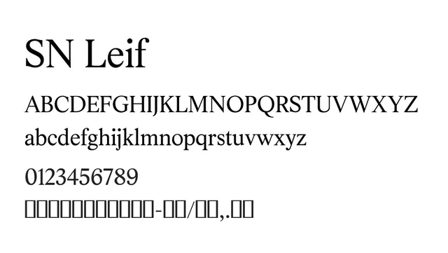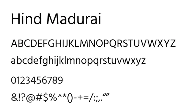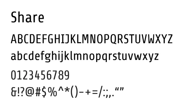
Preview image. Unlock full-res
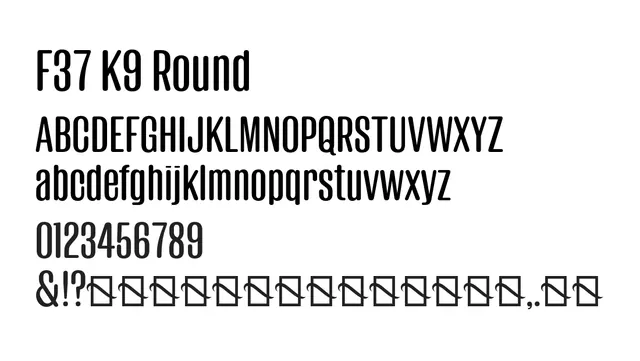
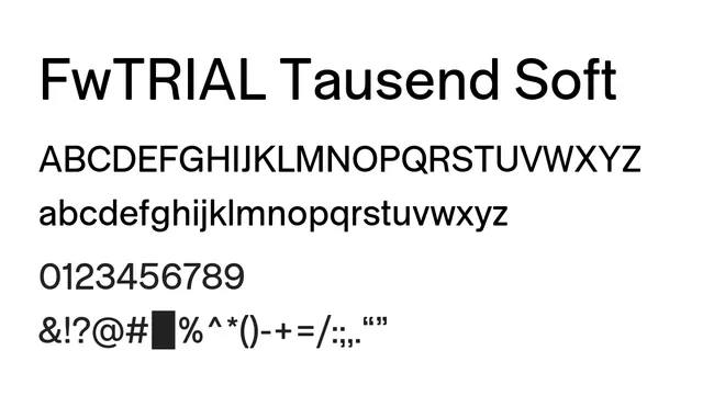
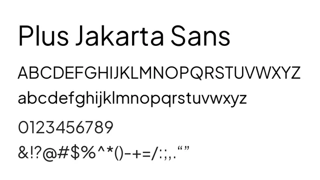
A contemporary neo-grotesque with humanist warmth, designed for modern digital and print applications.
Stylemodern, clean, friendly, approachable
Typesans-serif, neo-grotesque, humanist
Moodwarm, confident, contemporary, neutral
Summary
A contemporary neo-grotesque with humanist warmth, designed for modern digital and print applications.
What to use it for
Excellent for website body text and UI interfaces due to its clarity and generous spacing. Works well at all sizes from body copy to headlines. Reads clearly on screens and paper alike.
Pairing
Pairs well with Inter for a cohesive modern stack, or with a slab-serif like IBM Plex Serif for editorial contrast.