Preview image. Unlock full-res
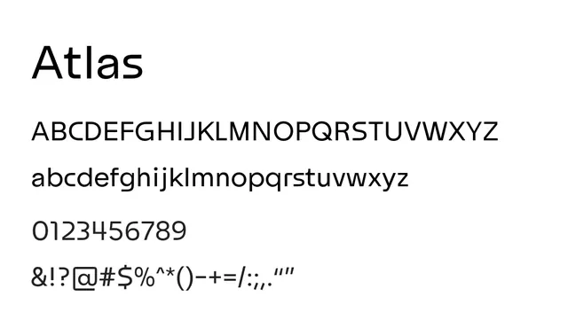
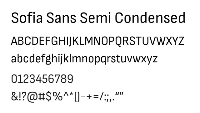
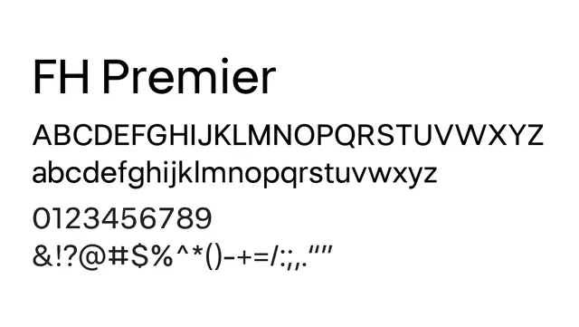
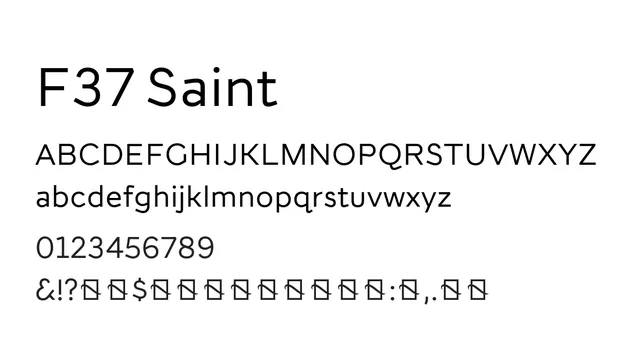
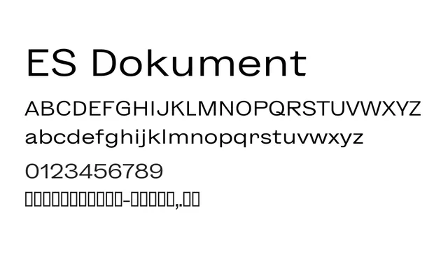
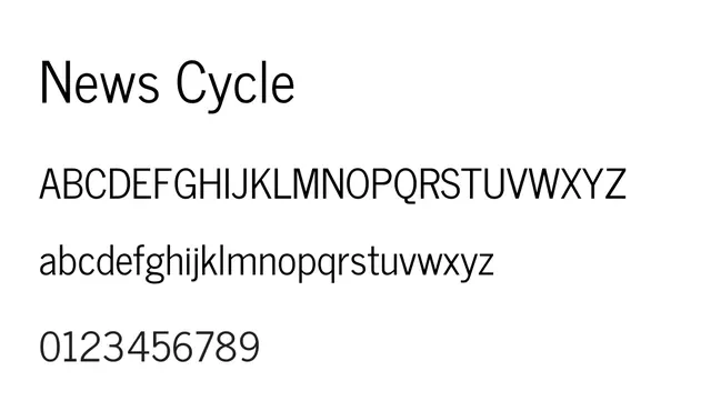
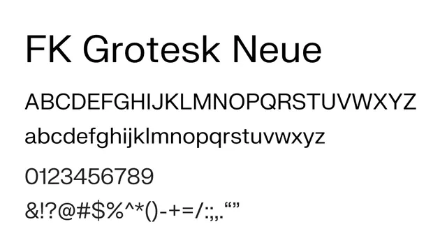
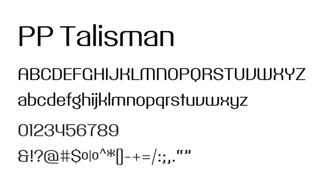
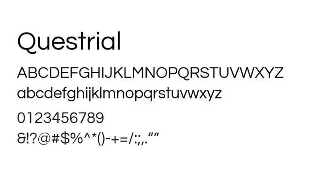
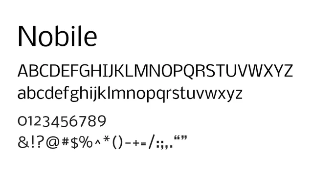
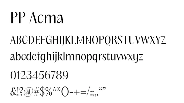
An elegant transitional sans with subtle serif echoes, striking sophisticated balance between classical refinement and modern sensibility.
Typesans-serif, transitional
Moodelegant, confident, professional, balanced
Industryeditorial, publishing, luxury, corporate, saas
Summary
An elegant transitional sans with subtle serif echoes, striking sophisticated balance between classical refinement and modern sensibility.
What to use it for
Excellent for editorial design, luxury branding, and upscale publications. The refined letterforms maintain legibility at body sizes while conveying premium quality and cultural sophistication.
Pairing
Pairs naturally with Courier Prime for contrast or with Freight Text for a serif emphasis.