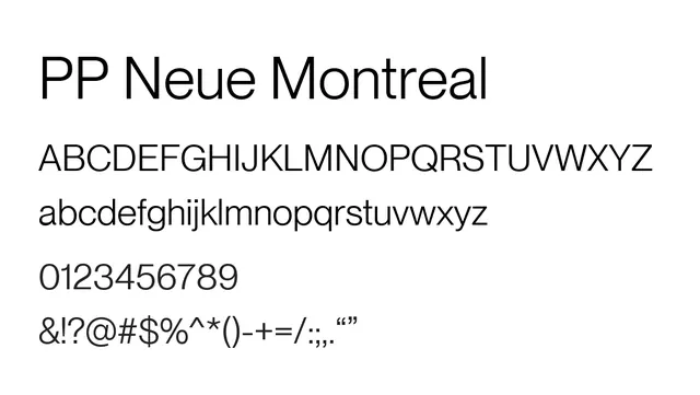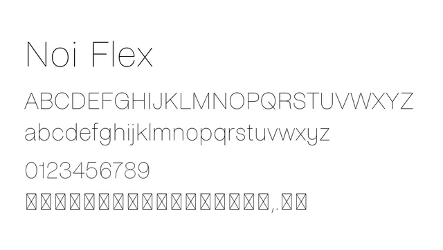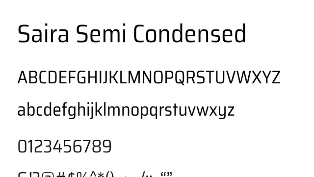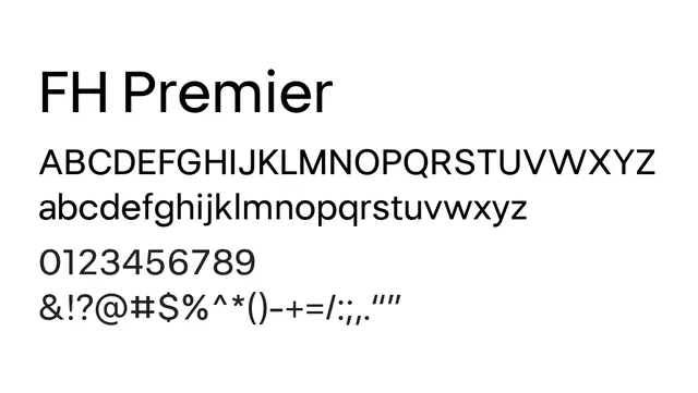
Preview image. Unlock full-res
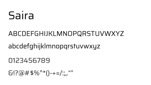
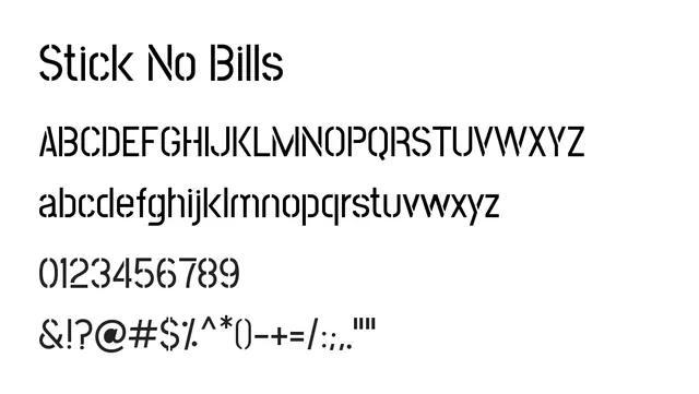
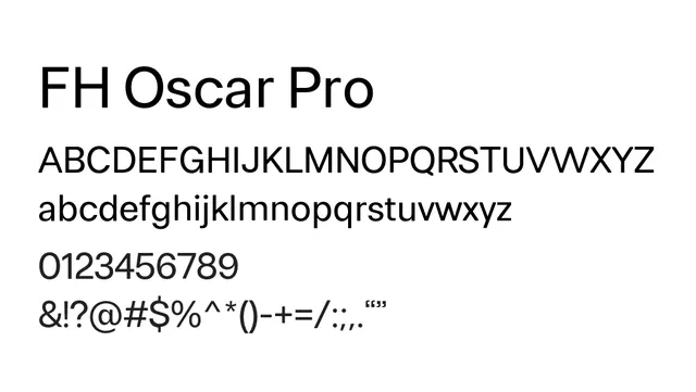
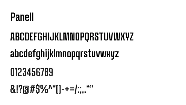
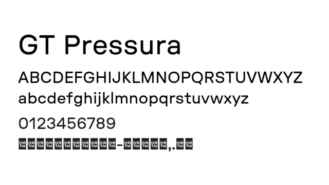
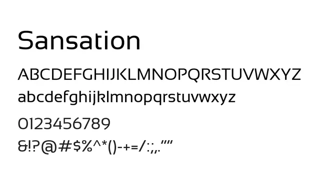
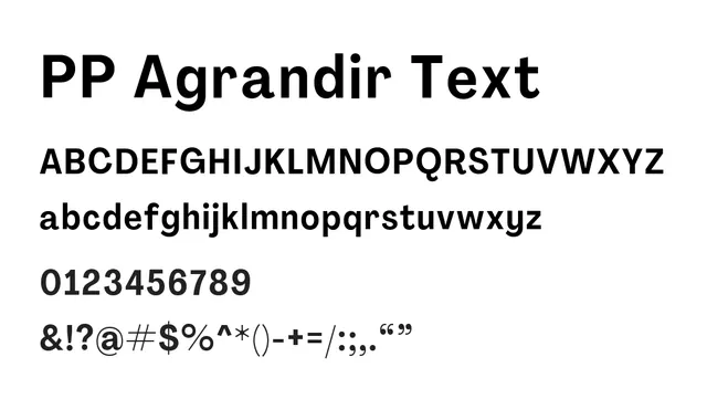
A balanced neo-grotesque with even width distribution and humanist undertones, providing neutral professional utility across sizes.
Summary
A balanced neo-grotesque with even width distribution and humanist undertones, providing neutral professional utility across sizes.
What to use it for
Versatile workhorse suitable for body text, interface design, and editorial applications. The geometric proportions ensure consistency across weights while subtle humanist curves maintain warmth. Excellent for corporate identity, tech products, and contemporary publishing requiring reliable readability without stylistic statements.
Pairing
Pairs effectively with serif faces like Lyon or Minion Pro for editorial contrast, or with geometric sans like Circular for modern tech stacks.