Preview image. Unlock full-res
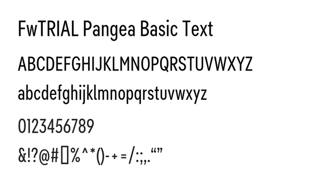
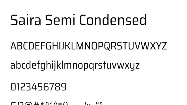
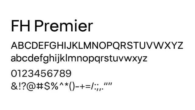
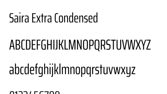
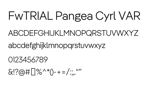
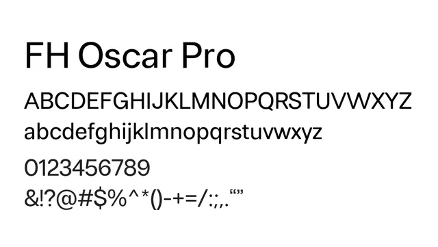
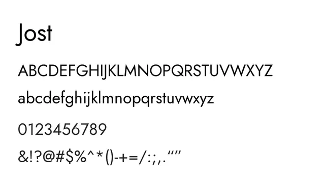
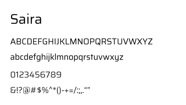
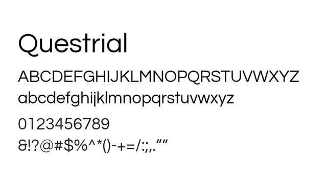
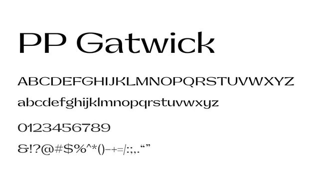
Geometric sans-serif with low contrast and clean terminals, ideal for contemporary digital interfaces.
Typesans-serif, geometric
Moodneutral, confident, professional, calm
Summary
Geometric sans-serif with low contrast and clean terminals, ideal for contemporary digital interfaces.
What to use it for
Works excellently as a UI typeface for app interfaces and web design, offering consistent legibility at small and large sizes. The geometric structure maintains clarity in dense layouts.
Pairing
Pairs well with a serif like Crimson Text or Playfair Display for editorial contexts, or with Inter for complementary sans-serif depth.