Preview image. Unlock full-res
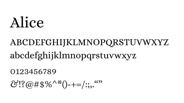
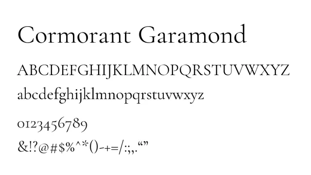
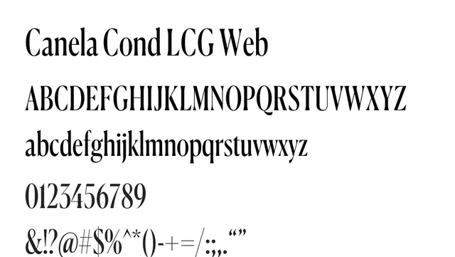
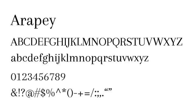
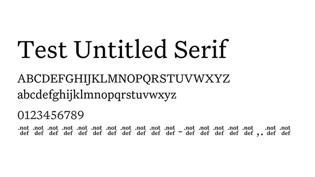
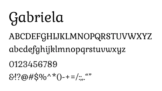
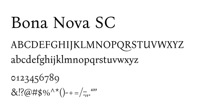
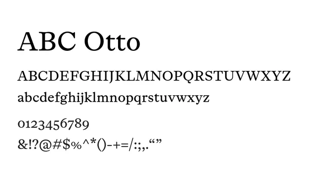
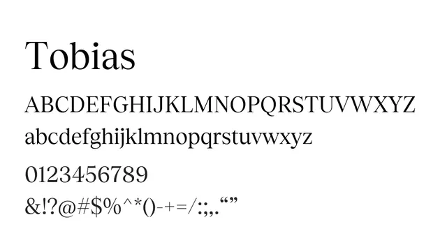
Transitional serif with refined proportions and moderate contrast, balancing classical elegance with modern readability.
Typeserif, transitional
Moodsophisticated, warm, editorial, timeless
Industryeditorial, publishing, luxury, fashion, corporate
Summary
Transitional serif with refined proportions and moderate contrast, balancing classical elegance with modern readability.
What to use it for
Ideal for editorial and book layouts where traditional sophistication is valued. The balanced contrast and well-proportioned serifs maintain excellent readability at body sizes while conveying editorial quality.
Pairing
Pairs beautifully with geometric sans-serifs like PP Gatwick or humanist sans-serifs for contemporary editorial design combining classical and modern aesthetics.