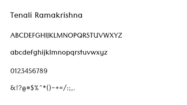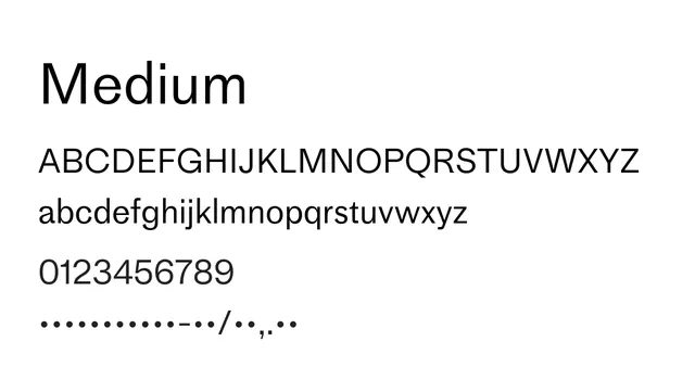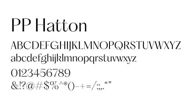
Preview image. Unlock full-res
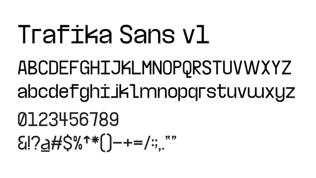
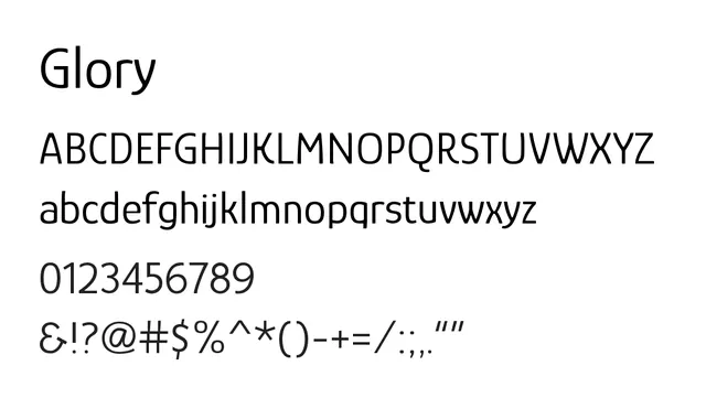
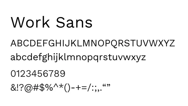
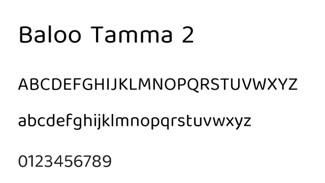
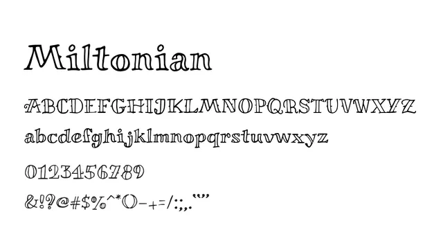
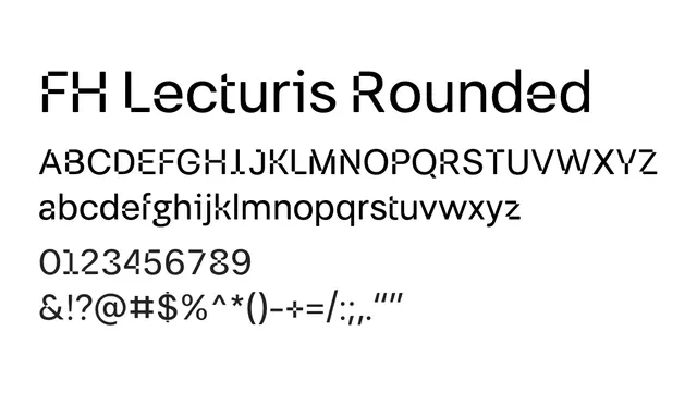
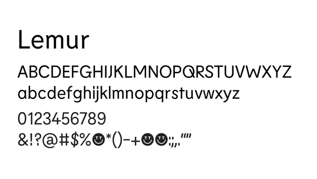
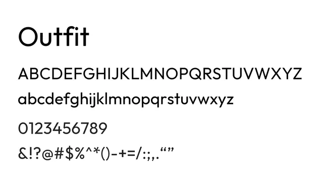
Humanist sans-serif with warm proportions and low contrast, creating an approachable and accessible reading experience.
Stylewarm, modern, friendly, approachable
Typesans-serif, humanist
Moodwarm, friendly, human, accessible, professional
Industrycorporate, saas, healthcare, education, wellness
Summary
Humanist sans-serif with warm proportions and low contrast, creating an approachable and accessible reading experience.
What to use it for
Excellent for body text and UI design where warmth and human-centered design matter. The humanist proportions feel less mechanical than geometric sans-serifs, making it suitable for healthcare, wellness, and educational contexts.
Pairing
Pairs effectively with transitional serifs like PP Grafier for mixed editorial layouts, or with geometric sans-serifs like PP Kyoto for hierarchy in digital design.