Preview image. Unlock full-res
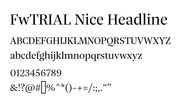
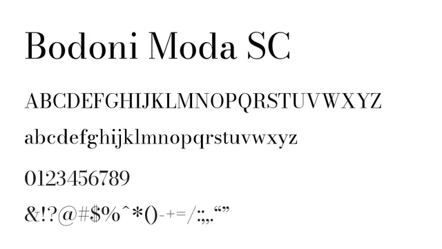
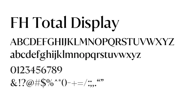
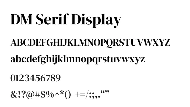
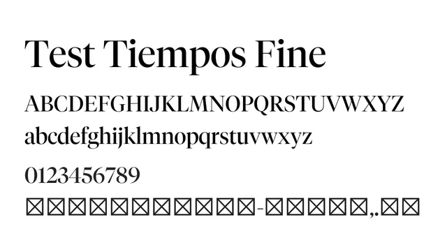
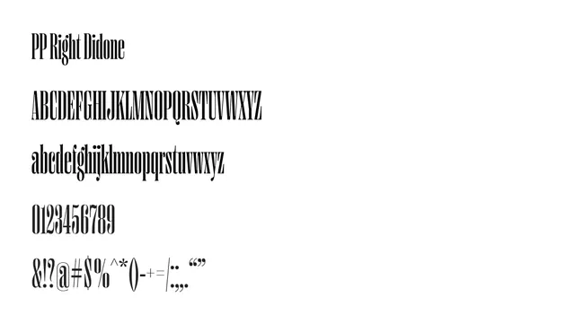
A refined didone serif with classical proportions and sharp thin-to-thick contrast, perfect for elegant headlines and luxury branding.
Styleelegant, classical, refined, high-contrast
Moodsophisticated, editorial, premium, formal
Summary
A refined didone serif with classical proportions and sharp thin-to-thick contrast, perfect for elegant headlines and luxury branding.
What to use it for
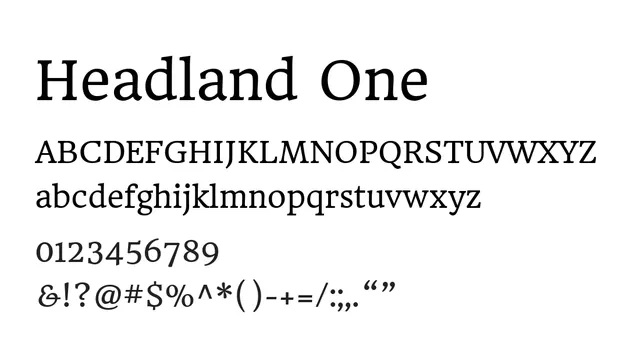
Best used as a display typeface for headlines, titles, and premium branding applications. Its high contrast and elegant character make it ideal for fashion, editorial, and luxury fintech contexts. Not recommended for body text at small sizes.
Pairing
Pairs excellently with PP Right Grotesk Text for a classic-modern contrast between serif headlines and clean sans body copy.