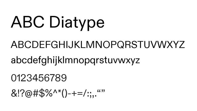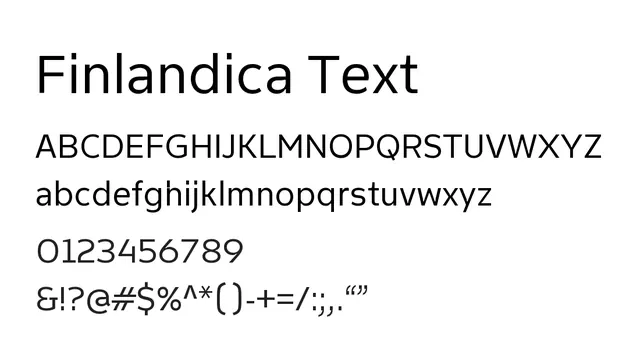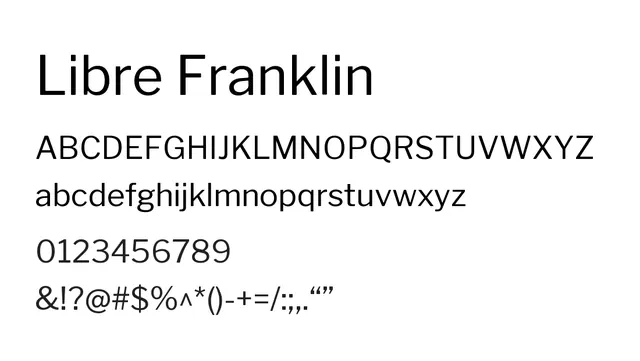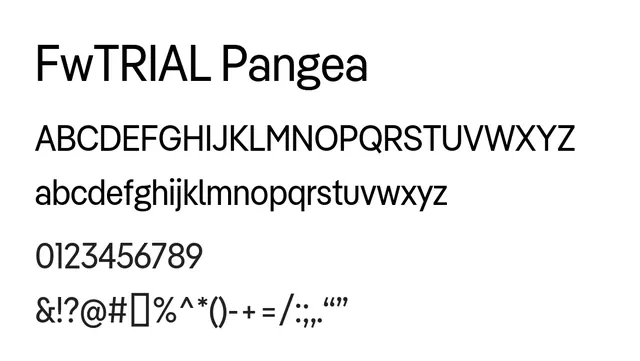
Preview image. Unlock full-res
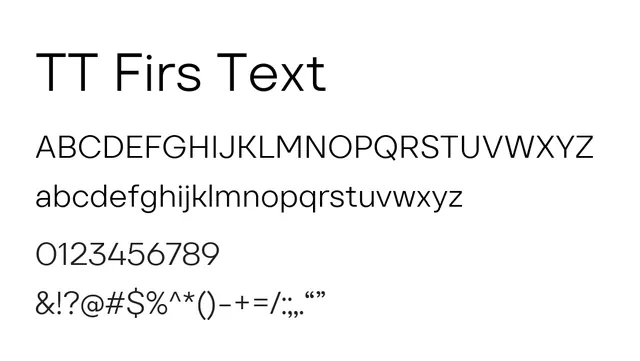
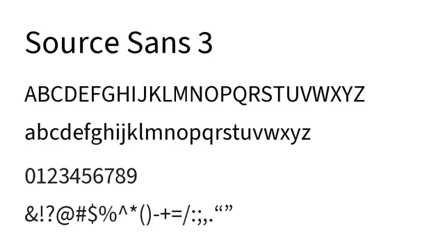
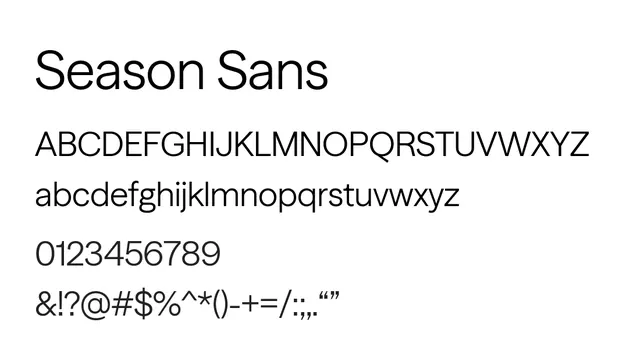
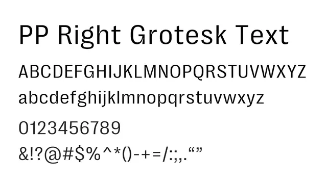
A humanist neo-grotesque sans-serif optimized for reading, with open apertures and balanced letterforms for body text and interface design.
Typesans-serif, neo-grotesque
Moodneutral, professional, approachable, clear
Summary
A humanist neo-grotesque sans-serif optimized for reading, with open apertures and balanced letterforms for body text and interface design.
What to use it for
Excellent for body text in long-form content, UI interfaces, and editorial layouts. Its high legibility and humanist touches make it approachable yet professional. Works equally well for headlines and body copy across a range of sizes.
Pairing
Pairs naturally with PP Right Didone for classical elegance, or with PP Right Grotesk Mono for technical projects.