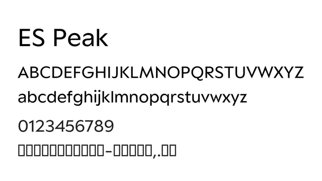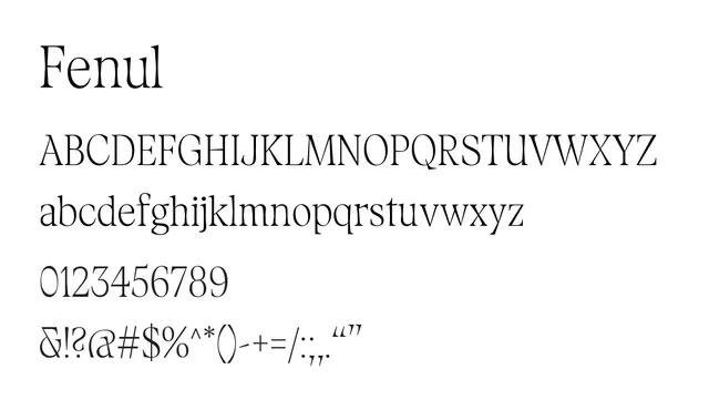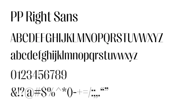
Preview image. Unlock full-res
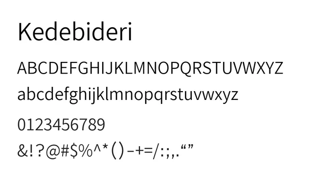
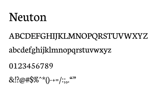
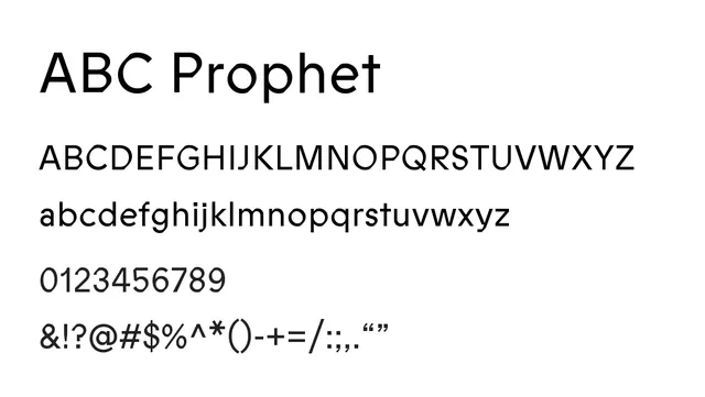
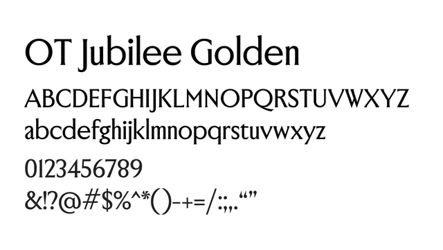
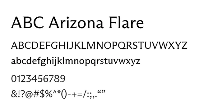
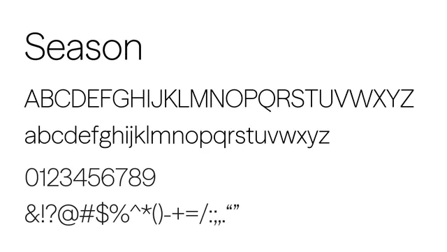
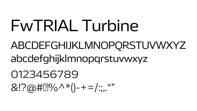
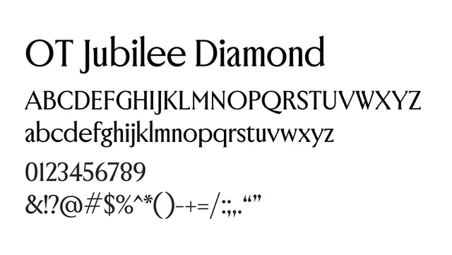
A refined transitional sans-serif with humanist touches and elegant proportions, balancing formality with approachability.
Typesans-serif, transitional
Moodwarm, elegant, sophisticated, approachable
Summary
A refined transitional sans-serif with humanist touches and elegant proportions, balancing formality with approachability.
What to use it for
Versatile typeface suitable for both headlines and body copy. Its refined character and humanist touches make it elegant yet accessible, working well in editorial, luxury, and corporate contexts. Strong visual presence at display sizes while remaining readable at text sizes.
Pairing
Pairs well with PP Right Didone for premium editorial design, or with PP Right Grotesk for a modern, balanced system.