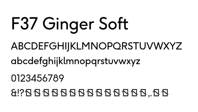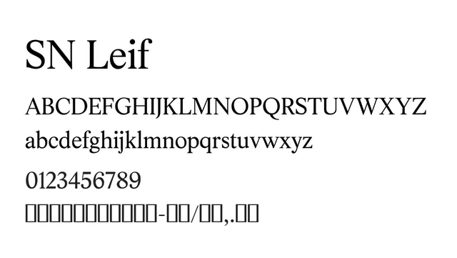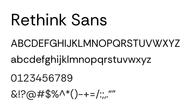
Preview image. Unlock full-res
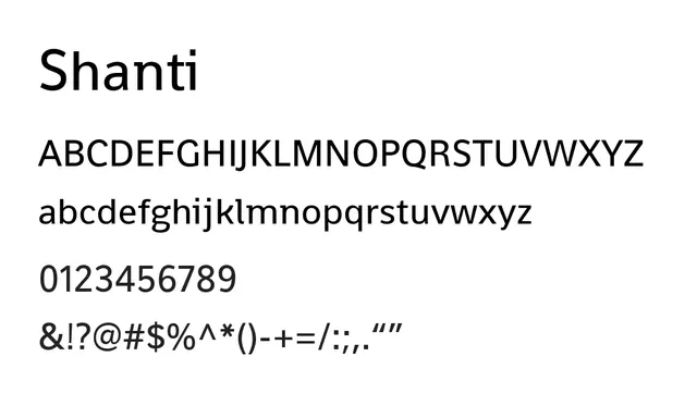
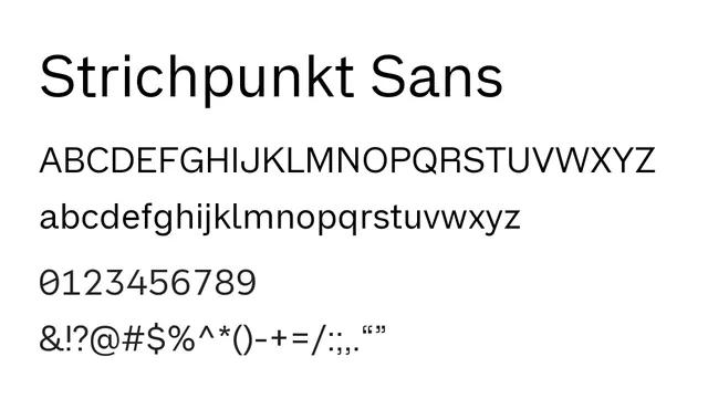
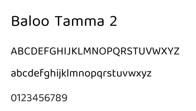
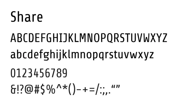
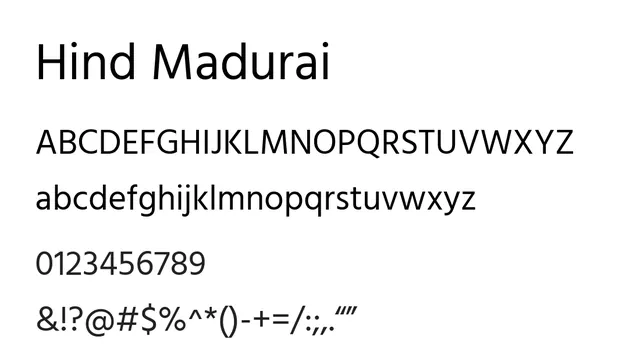
Humanist sans-serif with generous apertures and approachable character, designed for comfortable reading in both UI and print contexts.
Styleclean, friendly, modern, approachable
Typesans-serif, humanist
Moodwarm, friendly, approachable, neutral, welcoming
Summary
Humanist sans-serif with generous apertures and approachable character, designed for comfortable reading in both UI and print contexts.
What to use it for
Perfect for user interfaces where readability and accessibility are priorities. Works well as body text and headlines. The warm humanist forms make it suitable for brands seeking friendly, approachable communication.
Pairing
Pair with Relic for bold headlines, or use Replica/Replica TT as a geometric counterpart for visual contrast in editorial work.