Preview image. Unlock full-res
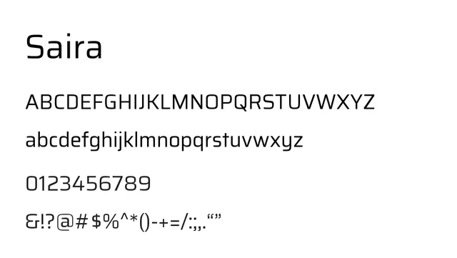
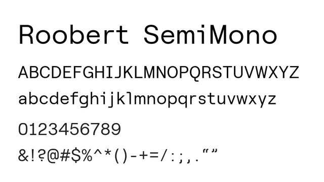
A geometric sans-serif with semi-monospaced proportions, balancing proportional legibility with technical clarity.
Moodneutral, confident, technical, approachable
Summary
A geometric sans-serif with semi-monospaced proportions, balancing proportional legibility with technical clarity.
What to use it for
Excellent for data-heavy interfaces and dashboards where consistency matters but full monospacing isn't needed. Works well in code comments or mixed typography scenarios where technical precision meets user-friendly spacing.
Pairing
Bridges Roobert proportional and Roobert Mono, working with either for cohesive multilevel hierarchy in technical products.