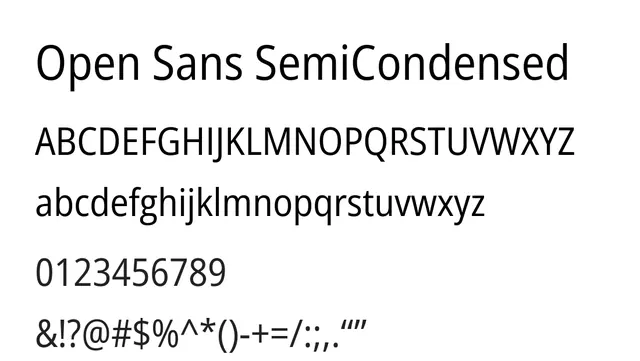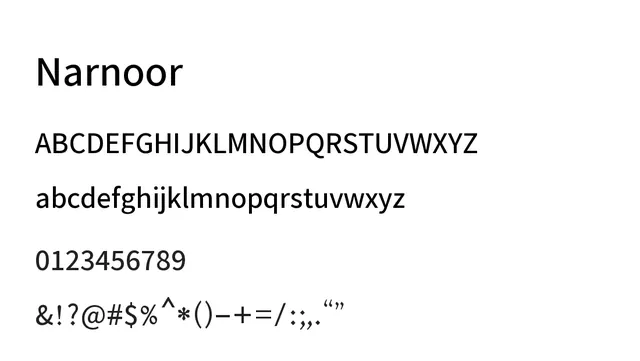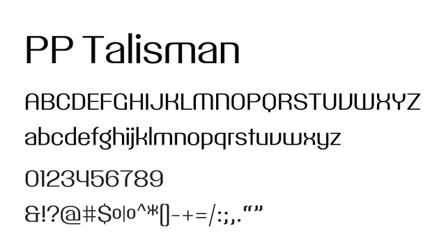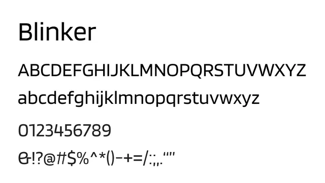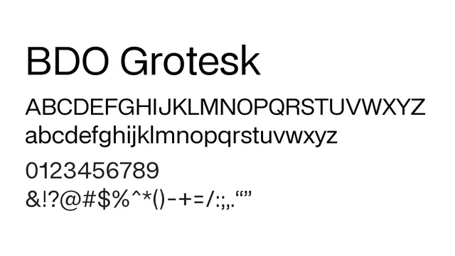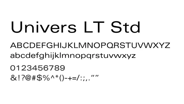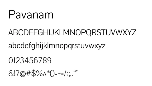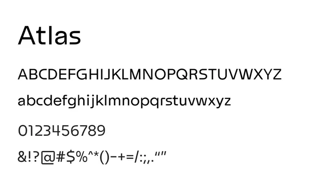
Preview image. Unlock full-res
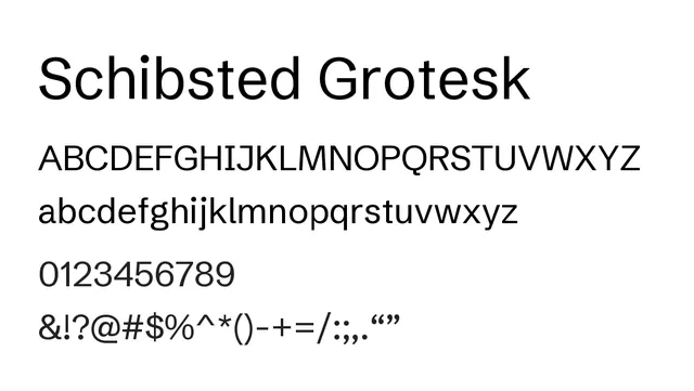
Contemporary neo-grotesque sans-serif with generous spacing and minimal contrast, designed for friendly, approachable digital interfaces and editorial design.
Summary
Contemporary neo-grotesque sans-serif with generous spacing and minimal contrast, designed for friendly, approachable digital interfaces and editorial design.
What to use it for
Excellent for digital interfaces, body text on screens, and editorial applications. Its open letter forms and low contrast make it particularly effective for accessibility and screen reading.
Pairing
Pairs naturally with Schibsted Grotesk itself across weights, or with serif faces like Merriweather for hybrid editorial designs.