Preview image. Unlock full-res
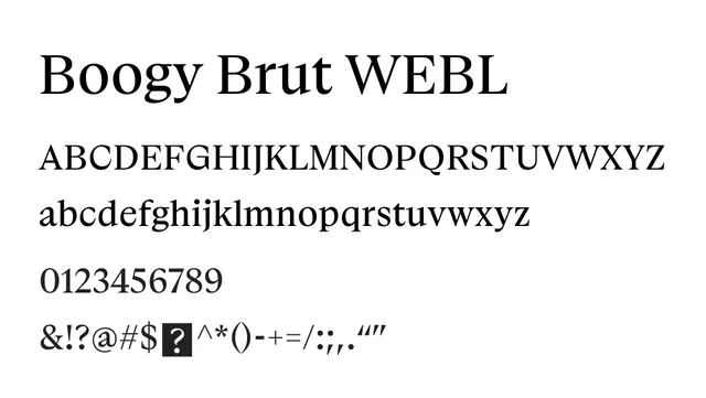
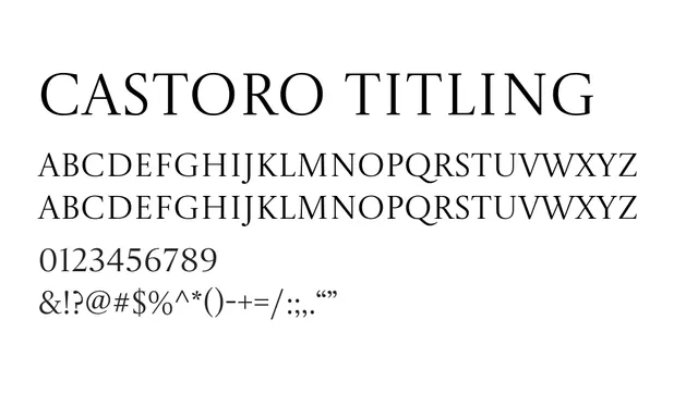
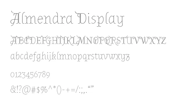
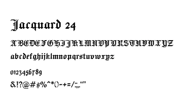
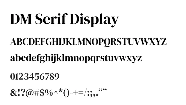
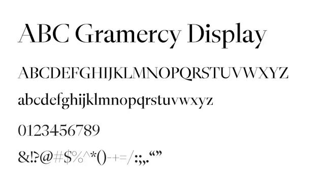
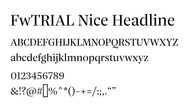
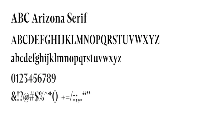
Elegant didone serif with pronounced thick-and-thin contrast and classical proportions, suitable for upscale editorial and branding.
Styleelegant, classical, refined, high-contrast
Industryeditorial, fashion, luxury, branding, publishing
Summary
Elegant didone serif with pronounced thick-and-thin contrast and classical proportions, suitable for upscale editorial and branding.
What to use it for
Perfect for fashion magazine mastheads, luxury brand identity, editorial headlines, or book covers seeking a traditional yet refined aesthetic. The strong vertical stress and high contrast make it striking at display sizes.
Pairing
Combines well with a sophisticated transitional serif like Lora for body text, or pair with a clean geometric sans like Montserrat to bridge classical and contemporary aesthetics.