Preview image. Unlock full-res
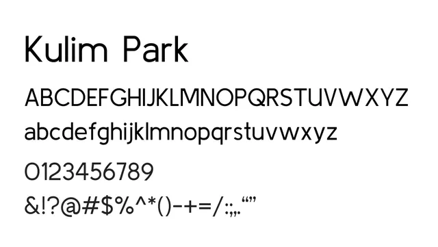
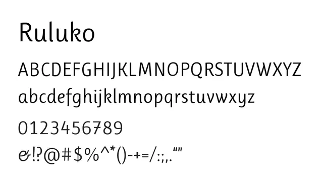
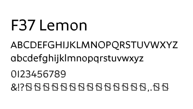
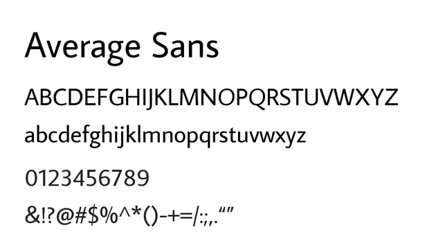
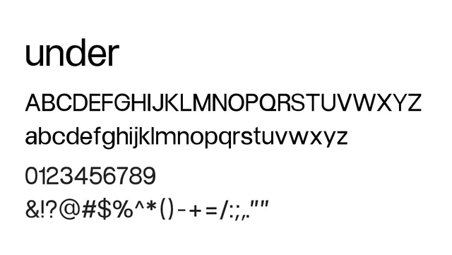
A restrained, minimal grotesque sans optimized for neutral, functional typography; strong for editorial and UI applications.
Styleclean, minimal, neutral, understated, technical
Typesans-serif, minimal, contemporary
Moodcalm, professional, neutral, focused, restrained
Industryeditorial, fintech, corporate, saas, technology, publishing
Summary
A restrained, minimal grotesque sans optimized for neutral, functional typography; strong for editorial and UI applications.
What to use it for
Under is well-suited to body text in editorial, web, and corporate contexts where clarity and neutrality are valued. Its low contrast and minimal personality allow content to take center stage without typographic distraction.
Pairing
Complements serif typefaces like Lyon or Publico for editorial layouts combining serif and sans.