Preview image. Unlock full-res
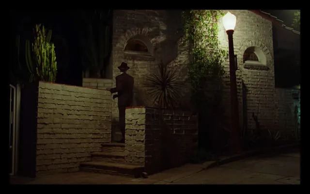
A cinematic photograph of a man in a hat and suit walking up stone steps toward a brick building at night, illuminated by a single street lamp.
Summary
A cinematic photograph of a man in a hat and suit walking up stone steps toward a brick building at night, illuminated by a single street lamp.
Visual description
A man wearing a dark suit and hat is positioned in the center, walking up stone stairs. The scene is dominated by dark shadows and warm light from a glowing street lamp on the right, casting light onto a textured brick wall and lush greenery.
Key takeaway
Use high-contrast chiaroscuro lighting to create a sense of mystery and depth in a nocturnal setting.
Reuse notes
Use this aesthetic for film noir-inspired storytelling or moody urban photography.
More like this



Keep what you find
A free account saves references to boards and can send you a weekly email of picks based on what you save.
To see every result, go Pro.