Preview image. Unlock full-res
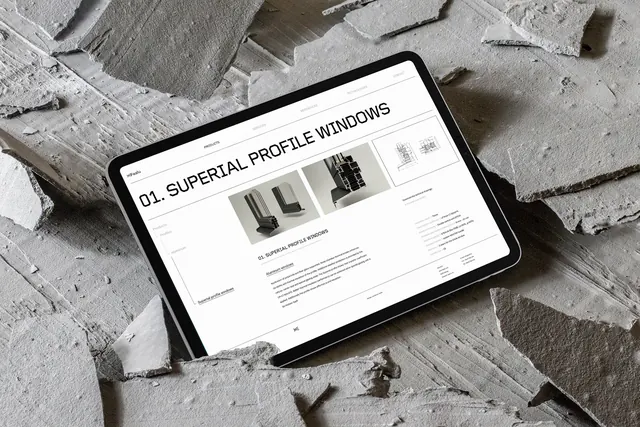
A digital tablet displaying a minimalist website interface for '01. SUPERIAL PROFILE WINDOWS' resting on a textured pile of concrete debris.
Summary
A digital tablet displaying a minimalist website interface for '01. SUPERIAL PROFILE WINDOWS' resting on a textured pile of concrete debris.
Visual description
The UI features a clean white background with black sans-serif typography and technical product photography of window profiles. The tablet is placed diagonally atop a high-contrast, monochromatic pile of rough concrete fragments.
Key takeaway
Use high-contrast, gritty textures in the environment to create a striking juxtaposition with a clean, minimalist digital interface.
Reuse notes
Ideal for showcasing architectural products, industrial design portfolios, or construction-related branding in a high-end context.