Preview image. Unlock full-res
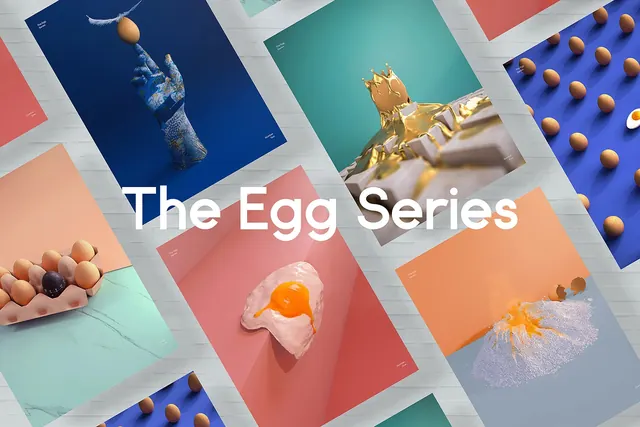
A collage of various graphic posters featuring eggs in surreal and artistic compositions.
Summary
A collage of various graphic posters featuring eggs in surreal and artistic compositions.
Visual description
The composition features multiple overlapping rectangular cards arranged diagonally on a light grey slatted background. Each card displays a different egg-themed subject, such as a fried egg, a golden egg, or eggs scattered on colored surfaces. The central text 'The Egg Series' is rendered in a large, white, sans-serif typeface.
Key takeaway
Use high-contrast color blocking and surreal imagery to create a cohesive yet diverse visual identity system.
Reuse notes
Use this approach for a thematic collection or a series of social media tiles that need to feel unified through color and subject matter.
More like this








Keep what you find
A free account saves references to boards and can send you a weekly email of picks based on what you save.
To see every result, go Pro.