Preview image. Unlock full-res
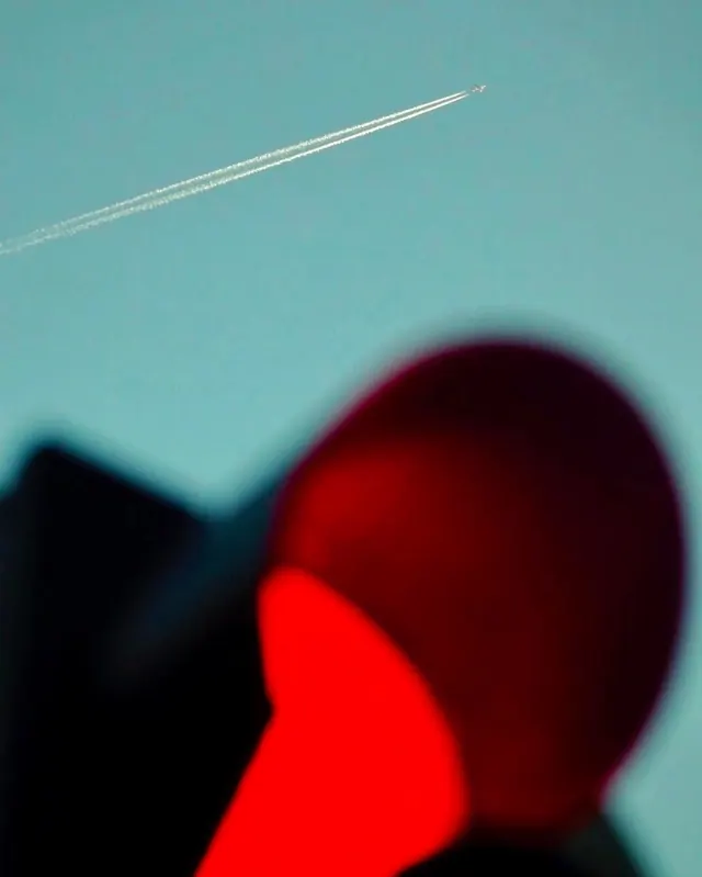
A photograph featuring a sharp white contrail cutting across a teal sky, contrasted against a large, out-of-focus red shape in the foreground.
Summary
A photograph featuring a sharp white contrail cutting across a teal sky, contrasted against a large, out-of-focus red shape in the foreground.
Visual description
A thin, white jet contrail streaks diagonally across a solid teal sky. In the foreground, a large, blurred red circular shape dominates the lower right, creating a sense of depth through extreme shallow focus.
Key takeaway
Use extreme shallow depth of field and high-contrast color blocking to create a sense of scale and abstraction.
Reuse notes
Use this composition when you want to evoke a sense of vastness or solitude through minimalist color and light.
More like this









Keep what you find
A free account saves references to boards and can send you a weekly email of picks based on what you save.
To see every result, go Pro.