Preview image. Unlock full-res
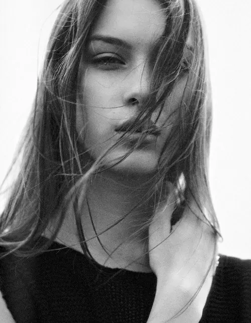
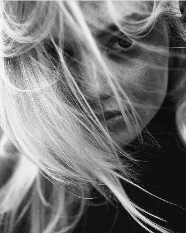
A close-up, monochrome portrait of a woman with long hair partially obscuring her face.
Summary
A close-up, monochrome portrait of a woman with long hair partially obscuring her face.
Visual description
A high-contrast black and white photograph featuring a woman's face partially veiled by strands of her hair. The composition is a tight close-up against a bright, blown-out background, emphasizing the textures of the hair and skin.
Key takeaway
Use high-contrast monochrome tones and layered textures like hair to create depth and a sense of mystery in portraiture.
Reuse notes
Ideal for high-end fashion editorials, beauty campaign imagery, or artistic profile photography.
More like this
Keep what you find
A free account saves references to boards and can send you a weekly email of picks based on what you save.
To see every result, go Pro.