Preview image. Unlock full-res
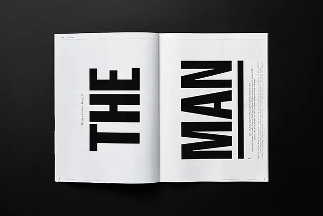
A high-contrast, minimalist editorial spread featuring oversized typography across two pages.
Summary
A high-contrast, minimalist editorial spread featuring oversized typography across two pages.
Visual description
The design features the words 'THE' and 'MAN' in massive, black, condensed sans-serif type spanning the left and right pages. A vertical black line separates the large text from a block of smaller body text on the right page. The layout uses a stark white background with extreme contrast.
Key takeaway
Use massive, oversized typography as the primary visual element to create immediate impact and hierarchy.
Reuse notes
Use this approach for magazine covers, posters, or hero sections where bold typographic expression is more important than imagery.
More like this
Keep what you find
A free account saves references to boards and can send you a weekly email of picks based on what you save.
To see every result, go Pro.