Preview image. Unlock full-res
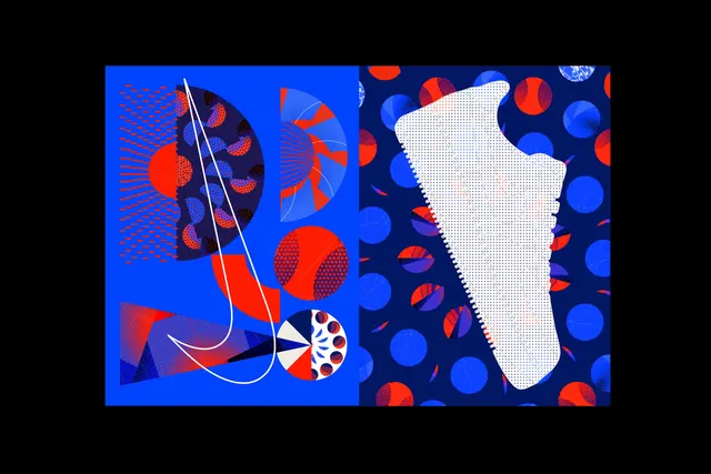
A split-screen graphic featuring a blue left panel with geometric shapes and a white swoosh-like line, and a dark blue right panel with a white sneaker silhouette and colorful polka dots.
Summary
A split-screen graphic featuring a blue left panel with geometric shapes and a white swoosh-like line, and a dark blue right panel with a white sneaker silhouette and colorful polka dots.
Visual description
The left side features a bright blue background with red and dark blue circular patterns, geometric shards, and a white curved line. The right side uses a dark blue background with various colored polka dots and a white, textured sneaker silhouette.
Key takeaway
Use high-contrast color blocking and overlapping geometric patterns to create a sense of movement and energy.
Reuse notes
Ideal for sports apparel branding, energetic social media graphics, or dynamic event posters.
More like this





Keep what you find
A free account saves references to boards and can send you a weekly email of picks based on what you save.
To see every result, go Pro.