Preview image. Unlock full-res
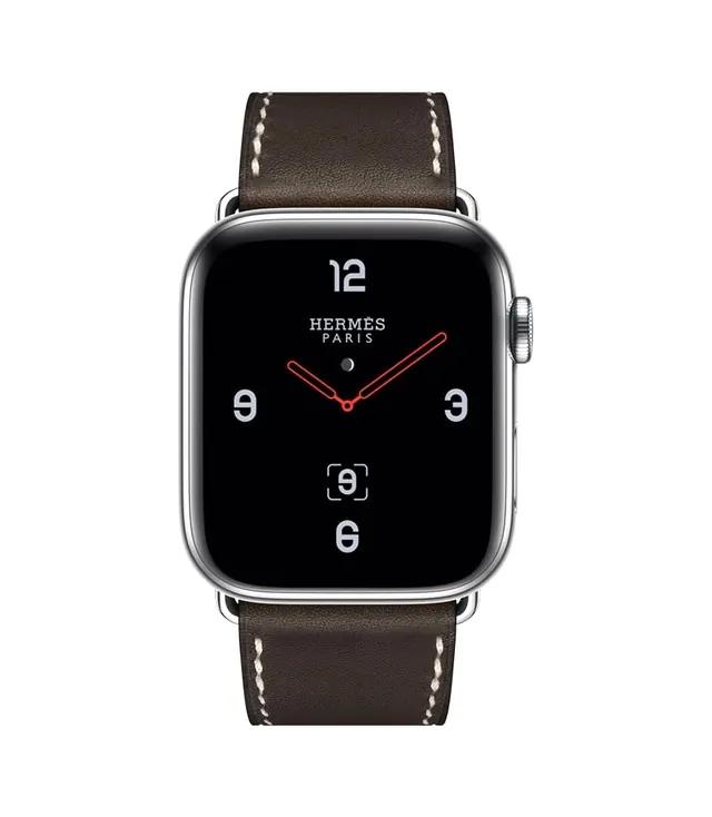
A studio photograph of a smartwatch featuring a black digital face with white numerals and red hands, paired with a dark brown leather strap with white stitching.
Summary
A studio photograph of a smartwatch featuring a black digital face with white numerals and red hands, paired with a dark brown leather strap with white stitching.
Visual description
A centered smartwatch with a black screen displaying white numerals and the 'HERMÈS PARIS' wordmark. The watch is attached to a dark brown leather strap featuring prominent white contrast stitching. The lighting is soft and even against a plain white background.
Key takeaway
The use of high-contrast white typography on a dark background paired with premium materials creates an immediate sense of luxury.
Reuse notes
Use this aesthetic for high-end wearable technology or luxury fashion accessory product photography.
More like this



Keep what you find
A free account saves references to boards and can send you a weekly email of picks based on what you save.
To see every result, go Pro.