Preview image. Unlock full-res
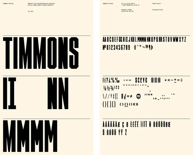
A comprehensive typeface specimen showing letterforms, numerals, symbols, and specimen text in a two-panel layout.
Summary
A design system specimen sheet for the Timmons typeface showing bold display weights and a complete character set across two vertical panels on a cream background.
Visual description
A two-panel spreads on an off-white or cream background separated by a vertical rule line. The left panel displays large, bold, condensed letterforms (spelling "TIMMONS" and "MMMM") in black type, illustrating the typeface's heavy weight and geometric character. The right panel is a denser character reference sheet displaying the complete alphabet (A–Z), numerals (0–9), punctuation marks, and special symbols arranged in organized rows. Both panels include small header text providing foundry or designer information and release dates. The typography appears geometric, constructed, and technical—possibly inspired by brutalist or Swiss design principles. All composition is aligned to grid, with no imagery or ornament.
Key takeaway
Separating display use from reference use across two panels allows both visual drama and functional clarity in the same specimen. The scale shift from massive letterforms to detailed character sets creates a compelling narrative of the typeface's range. Minimal typography at the header level keeps focus on the letterforms themselves.
Reuse notes
Ideal template for typeface releases, foundries, and design system documentation. The layout works at both poster and booklet scale. Consider leading, margins, and grid alignment carefully to ensure readability at smaller sizes. The cream background provides warmth compared to pure white—consider the print substrate's impact on optical weight.
More like this


Keep what you find
A free account saves references to boards and can send you a weekly email of picks based on what you save.
To see every result, go Pro.