Preview image. Unlock full-res
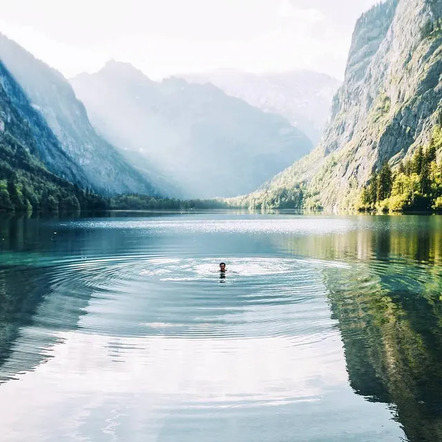
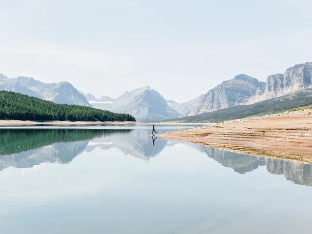
A wide landscape photograph of a person swimming in a calm mountain lake, creating concentric ripples on the water's surface, framed by steep, misty mountains.

Summary
A wide landscape photograph of a person swimming in a calm mountain lake, creating concentric ripples on the water's surface, framed by steep, misty mountains.
Visual description
A person is centered in the middle ground, creating circular ripples on the clear, reflective water. The composition features steep, rocky mountains on both sides that lead the eye toward a misty, sunlit valley in the background. The color palette is dominated by cool blues, greens, and soft white light.
Key takeaway
Use a centered subject with symmetrical natural framing to create a sense of scale and tranquility.
Reuse notes
Ideal for travel posters, wellness branding, or background imagery for outdoor lifestyle content.
More like this
Keep what you find
A free account saves references to boards and can send you a weekly email of picks based on what you save.
To see every result, go Pro.