Preview image. Unlock full-res
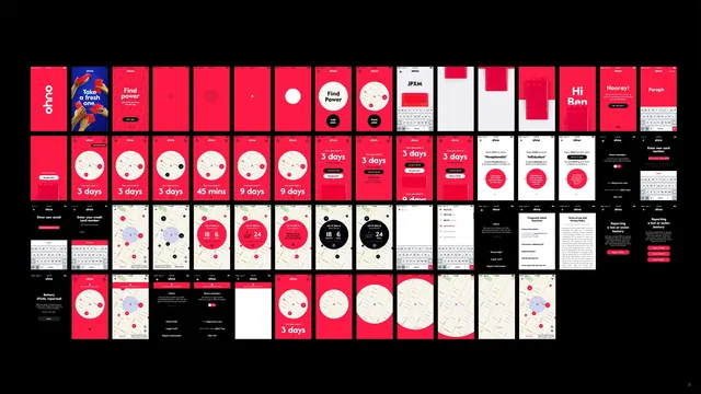
A comprehensive grid specimen showcasing a design studio's 10-year output across brand identity, app interfaces, and collateral in bold red, white, and black.
Summary
A tightly organized grid specimen displaying a design studio's decade of work—brand identities, app screens, and promotional materials—unified by a bold red, white, and black palette and clean geometric layout.
Visual description
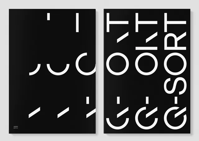
A large multifunctional grid arranges dozens of rectangular project thumbnails in strict rows against a black background. Each project tile features the studio's consistent color language: bold red (#ED1C46), cream, and pure white, with sans-serif typography. Visible items include app interfaces (many with circular timing elements showing "3 days"), brand identity lockups, promotional posters, map-based screens, and editorial layouts. The organization is hierarchical and modular, with red tiles anchoring attention while cream and white tiles provide rhythm. Some tiles feature minimal geometric shapes, others show full UI mocks.
Key takeaway
The discipline of a unified visual language applied consistently across 10 years of diverse work. Bold, restrictive color palette (three colors) creates coherence and memorability. Specimen sheets that showcase breadth while maintaining design authority. Modular grid systems that feel comprehensive without becoming chaotic.
Reuse notes
Ideal for design studio portfolios, annual reports, design system documentation, or brand overviews. The red-on-black foundation reads modern and confident. Works as a cover image, poster, or wall installation. The consistent language makes it a powerful proof of design consistency. Best when the studio's own work is genuinely diverse—the grid format makes weak projects obvious. Requires thoughtful curation to remain visually balanced.