Preview image. Unlock full-res
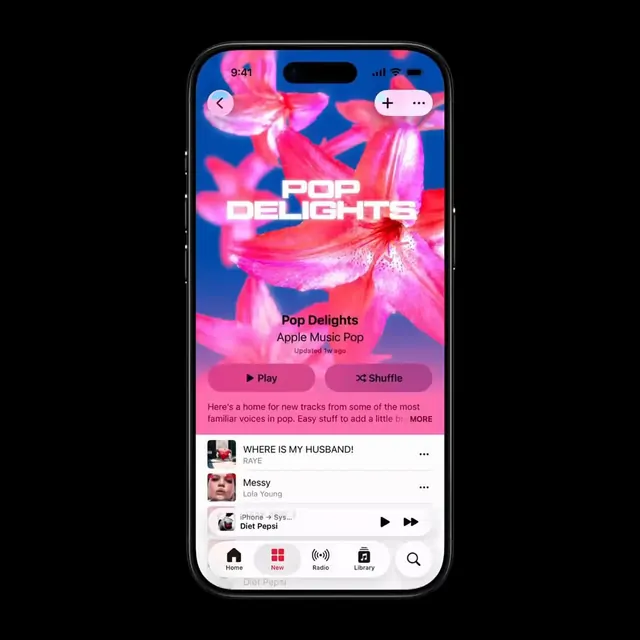
Apple Music interface with vibrant pink-to-blue gradient, photographic florals, and bold sans-serif typography for playlist presentation.
Summary
Apple Music interface mockup with vibrant gradient blending hot pink and electric blue, layered over photographic florals, centered title and control buttons for a playlist.
Visual description
Mobile phone mockup with rounded corners showing a full-screen music app interface. The upper two-thirds feature a vivid color gradient flowing from hot pink in the top corners through magenta at center to electric blue in the bottom-right. Three large-scale photographic flowers (tulips or similar) are composited over the gradient with soft, painterly edges. Below the hero gradient sits a centered white-text headline "POP DELIGHTS" in bold, condensed sans-serif, followed by "Apple Music Pop" and "Updated 1w ago" in smaller dark text. Two pill-shaped buttons (Play, Shuffle) in darker pink sit beneath. The bottom third displays three song rows with album thumbnails, song titles, and artists in a white card stack. A dark tab bar with five navigation icons anchors the bottom.
Key takeaway
The saturated gradient background as a container for photographic imagery, with the white typography creating separation without a solid overlay. The two-tier button hierarchy (prominent action plus secondary option) in a compact mobile footer. The card-stack layout for lists within a full-bleed header zone.
Reuse notes
Strong for music, podcast, or media streaming mobile interfaces. The gradient and florals read as playful and premium; works well for lifestyle or entertainment verticals. The high saturation demands clear contrast on text, so pair with condensed weights or all-caps treatments. Less suitable for productivity or technical categories.
More like this



Keep what you find
A free account saves references to boards and can send you a weekly email of picks based on what you save.
To see every result, go Pro.