Preview image. Unlock full-res
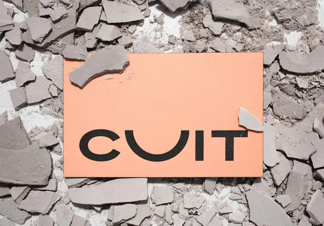
Conceptual graphic design showing the word "CULT" in bold sans-serif on a peachy-orange card placed atop a cracked concrete or plaster texture.
Summary
A bold typographic composition featuring the word "CULT" in thick sans-serif letters on a warm peach-coloured card overlaid on a textured cracked surface.
Visual description
A rectangular card in warm peachy-salmon tone is placed diagonally across a background of cracked, weathered concrete or plaster. The cracked surface is grey and white with deep shadows showing structural damage and age. The card displays the word "CULT" in chunky, all-caps black sans-serif type with modern, clean letterforms. The contrast between the fresh, flat colour of the card and the heavily textured, organic cracking creates visual tension. The composition is raw and conceptual, suggesting themes of contrast, impermanence, or intervention.
Key takeaway
The powerful use of textural contrast to make flat graphic design elements pop. The cracked background texture adds conceptual depth and suggests themes of disruption or repair. The simple bold typography becomes more impactful through the layered composition.
Reuse notes
Effective for conceptual design work, branding proposals, or editorial graphics exploring themes of disruption and renewal. The contrast between industrial decay and clean design communicates contemporary aesthetic values. Works well for art projects, design conferences, or provocative campaigns. The textured background photography makes the graphic element feel three-dimensional and tactile. Best used in contexts that benefit from edgy, conceptual visual language. The warm card color is flexible for rebranding to different colour systems while maintaining impact.