Preview image. Unlock full-res
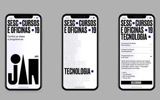
Three tightly composed mobile screens for SESC Cursos e Oficinas, pairing geometric iconography and dense typography with restrained white space.
Summary
Three side-by-side mobile screens for a Portuguese educational course directory, using bold geometric icons and hierarchy-driven typography to organize program details on minimal backgrounds.
Visual description
Left screen: a vertical layout with a large geometric cut-out (bold black circle, square, and organic shape) alongside the heading "SESC CURSOS E OFICINAS '19" in display sans-serif, white on gray. Middle screen: vertical typography hierarchy repeating the course title and overlaid text ("TECNOLOGIA" centered in a lighter weight) creating visual rhythm through repetition. Right screen: detailed information listing with condensed sans-serif, course dates, instructor names, and descriptions organized in vertical stacks, with a bold black "SELECIONAR" (select) button anchoring the bottom. All three balance white space with information density, using a consistent color palette of black, white, and neutral grays. A small blue dot provides accent on each.
Key takeaway
The nested geometric framing (circle, square, organic shape) as a memorable icon system. The use of repeated typography at different weights and scales to create hierarchy without color, relying on size and positioning alone. The balance of dense information listing with substantial white margins for scanability.
Reuse notes
Strong pattern for course directories, event-listing interfaces, or educational content platforms. Works best when the core information is structured hierarchically (title > date > instructor > description). The geometric icons are memorable enough to become brand-recognizable. Ensure adequate spacing around dense text blocks to maintain the professional, organized feel.
More like this




Keep what you find
A free account saves references to boards and can send you a weekly email of picks based on what you save.
To see every result, go Pro.