Preview image. Unlock full-res
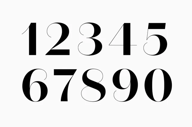
A collection of digits from 1 to 0 displayed in a high-contrast serif typeface.
Styletypographic, luxury, minimal
Colormonochrome
Moodelegant, sophisticated, premium
Industrybeauty, fashion, publishing
Tagsnumbers, digits, high-contrast, serif, typography
Palette
#FAFAFA
#0A0A0A
Summary
A collection of digits from 1 to 0 displayed in a high-contrast serif typeface.
Visual description
The image features black numerals 1 through 0 arranged in two rows on a light gray background. The typeface is a high-contrast serif with extreme variations between thick and thin strokes.
Key takeaway
Use extreme stroke weight contrast in serif typography to create a sense of luxury and sophistication.
Reuse notes
Ideal for high-end branding, editorial headers, or luxury packaging design.
More like this


Keep what you find
A free account saves references to boards and can send you a weekly email of picks based on what you save.
To see every result, go Pro.