Preview image. Unlock full-res
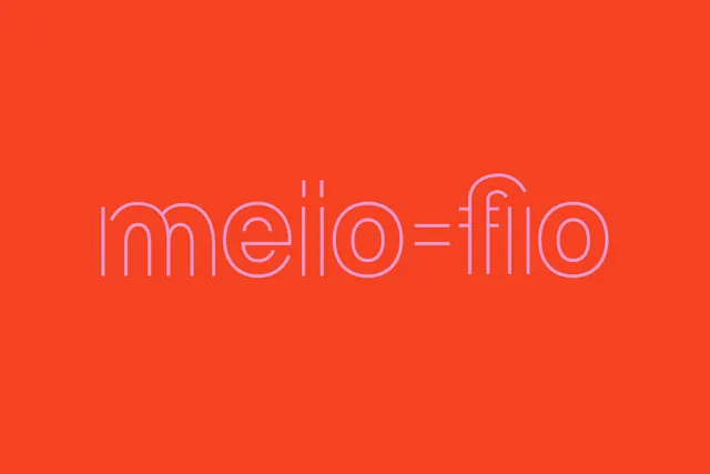
The word "meio-fio" in thin neon-style outline typeface centered on a solid bright red-orange background.
Summary
A single Portuguese word rendered in a thin neon-style outline typeface, displayed in a pale peachy tone against a vibrant red-orange background, creating high contrast and geometric letterform emphasis.
Visual description
Solid bright red-orange field filling the entire horizontal composition. Centered at mid-height is the word "meio-fio" set in a geometric, condensed sans-serif with all characters rendered as thin outlines in pale pink-white. The letters have rounded, modern terminals and consistent stroke width. Letterforms are tall and narrow, maximizing vertical space. Clean, minimal composition with no additional elements.
Key takeaway
The pairing of an extremely simple composition (one word, solid background, centered) with a distinctive neon-outline typeface treatment creates memorability through color contrast and letterform geometry alone. No secondary imagery needed.
Reuse notes
Strong for branding, title treatments, or poster-like display contexts. Works particularly well when the typography itself is the design statement. The neon-outline style reads well at small or large scale. Pairs effectively with minimalist design systems. Best suited to contexts where a single bold statement is the goal.
More like this
Keep what you find
A free account saves references to boards and can send you a weekly email of picks based on what you save.
To see every result, go Pro.