Preview image. Unlock full-res
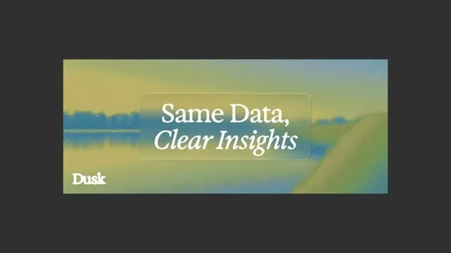
A centered gradient landscape graphic with a translucent text panel reading \"Same Data, Clear Insights\" and a small \"Dusk\" mark in the lower left.
Summary
A centered gradient landscape graphic with a translucent text panel reading "Same Data, Clear Insights" and a small "Dusk" mark in the lower left.
Visual description
The image shows a dark charcoal canvas with a wide rectangular artwork centered horizontally. Inside the artwork is a hazy landscape-like gradient in yellow, green, and blue tones, overlaid by a semi-transparent rounded rectangle containing the headline "Same Data, Clear Insights" in large white serif type. A small "Dusk" wordmark sits near the lower left corner of the artwork.
Key takeaway
Use a soft-focus gradient backdrop with a frosted text container to make a short value statement feel premium and legible. Pair a bold serif headline with a lighter italic subline for contrast.
Reuse notes
This works well for brand promos, campaign graphics, or hero banners where the goal is to feel calm and polished rather than literal. It is strongest on dark surrounding space and with only a small amount of text.
More like this



Keep what you find
A free account saves references to boards and can send you a weekly email of picks based on what you save.
To see every result, go Pro.