Preview image. Unlock full-res
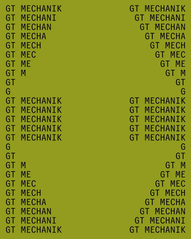
A striking typographic composition showing the words "GT MECHANIK" progressively shortened and repeated in columns against a bright lime green background.
Summary
A bold typographic design featuring the word "GT MECHANIK" repeatedly shown in progressive stages of truncation, arranged in two mirrored columns on a bright lime-green background.
Visual description
The composition is filled with monospace, all-caps sans-serif typography arranged in two columns. The left column starts with "GT MECHANIK" at the top and progressively removes letters from the end with each line (GT MECHANI, GT MECHAN, GT MECHA, GT MECH, GT MEC, GT ME, GT M, GT, G), creating a visual countdown effect. This pattern repeats multiple times down the column. The right column mirrors this arrangement. The bright lime-green background (nearly fluorescent) provides maximum contrast with the black text. The overall effect is systematic, geometric, and digital.
Key takeaway
Progressive reduction or variation of text creates visual rhythm and interest. Repetition of patterns feels systematic and mathematical. Bright, unexpected color choices (neon lime green) elevate simple typographic exercises. Monospace typography emphasizes the mechanical, algorithmic nature of the design.
Reuse notes
Works for tech, creative tech, experimental design, or data visualization contexts. Good for branding that wants to feel innovative or cutting-edge. The bright color appeals to young, forward-thinking audiences. Effective for posters, book covers, or digital design contexts. The typographic pattern can work at various scales. Avoid for conservative or luxury contexts where restraint is valued.
More like this

Keep what you find
A free account saves references to boards and can send you a weekly email of picks based on what you save.
To see every result, go Pro.