Preview image. Unlock full-res
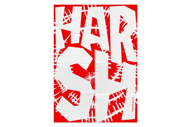
A bold abstract composition featuring fragmented letters and words in red and white, arranged in a chaotic overlapping grid pattern that creates visual rhythm through color and form.
Summary
A high-contrast typographic design featuring overlapping and fragmented letters spelling abstract words, rendered in bright red on white and arranged in a dynamic, seemingly random composition.
Visual description
The composition is divided by a geometric grid structure creating a chaotic layout. Large, bold sans-serif letters are arranged throughout, some complete (forming partial words like "EAR"), others fragmented or rotated at various angles. The letterforms are bright red with striped or textured infill patterns showing white lines through the red. The background is clean white. Letters overlap boundaries, creating visual complexity and dynamic tension. Some fragments appear to be constructivist or Eastern European design influenced. The overall effect feels both systematic (grid-based) and anarchic (overlapping, rotated elements).
Key takeaway
Fragmentation and rotation of familiar forms (letters) creates visual interest and movement. Extreme color contrast makes graphic work punch and command attention. Overlapping and layering adds depth and complexity to otherwise simple elements. Combining order (grid) with chaos (overlapping elements) creates visual dynamism.
Reuse notes
Excellent for experimental design, contemporary art, or design-focused branding. Works for book covers, posters, or editorial design emphasizing concept over clarity. The constructivist influence appeals to creative, design-conscious audiences. Strong for cultural institutions, music, or arts promotion. Can feel chaotic, so works best when some visual disorder or experimentation fits the brand message. Avoid for contexts requiring clear, primary messaging.
More like this
Keep what you find
A free account saves references to boards and can send you a weekly email of picks based on what you save.
To see every result, go Pro.