Preview image. Unlock full-res
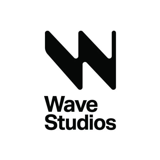
Minimal black-on-white logo lockup for Wave Studios: a bold geometric W icon with angular diagonal strokes and rounded corners stacked above bold sans-serif logotype, centered on white.
Summary
Stacked monochrome logo lockup for Wave Studios: a large geometric W mark built from three angular diagonal strokes with rounded tips sits directly above the two-line bold sans-serif wordmark on a plain white square.
Visual description
The icon occupies the upper half of the composition. It is constructed from three thick diagonal strokes that zigzag to form a W shape: two outer strokes angle sharply downward and inward, flanking a central peak that rises between them. All corners and terminals are consistently rounded at a medium radius, giving the otherwise sharp geometry a soft, approachable finish. The mark reads simultaneously as a letter W and as an abstract wave or lightning bolt. Below the icon, the word "Wave" on one line and "Studios" on the next are set in a heavy geometric sans-serif with tight letter-spacing and matching rounded terminals on the letterforms, reinforcing continuity with the icon. The entire system is pure black on white with generous surrounding white space. Square crop with centered alignment and no additional elements.
Key takeaway
The terminal-rounding trick: carrying the same corner radius from the icon into the typeface selection unifies mark and wordmark without needing a constructed bespoke lettering. The icon's double reading (letter + motion metaphor) is achieved purely through the angle and proportion of three strokes with no extra decorative elements. The square white space around the lockup is integral to the design, not just a blank frame.
Reuse notes
Textbook reference for studio, agency, or production company branding that needs to read equally well at icon-only scale (app icon, favicon) and at full lockup scale (letterhead, signage). The rounded-corner system is easy to implement in any vector tool. Works best in monochrome; avoid colorizing the icon unless the color system is equally considered throughout.
More like this
Keep what you find
A free account saves references to boards and can send you a weekly email of picks based on what you save.
To see every result, go Pro.