Preview image. Unlock full-res
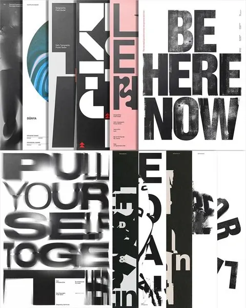
Curated mood board of diverse design samples featuring bold sans-serif typography, dark backgrounds, and minimalist layouts.

Summary
A layout design mood board combining ten design samples that showcase bold sans-serif type treatments, dark monochromatic palettes, and geometric composition systems.
Visual description
A grid layout of rectangular design samples arranged tightly together. The work includes magazine covers, book spines, poster treatments, and brand identity examples. Dominant colors are dark charcoal, off-white, and muted pink accents. Typographic treatments range from heavy chunky sans-serif to thin structural lettering. Geometric shapes, clean negative space, and symmetrical alignments create a cohesive editorial language across all pieces.
Key takeaway
How a limited color palette and consistent typographic treatment unify diverse design problems into a coherent visual system. The contrast between bold black type and white space creates impact while maintaining refinement.
Reuse notes
Excellent reference for building a cohesive design system, especially for editorial, publishing, or corporate identity. The approach works well when presenting multiple related design applications. May feel cold or austere in contexts requiring warmth or personality.
More like this



Keep what you find
A free account saves references to boards and can send you a weekly email of picks based on what you save.
To see every result, go Pro.