Preview image. Unlock full-res
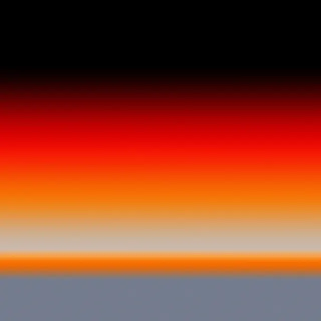
A smooth gradient composition transitioning from black through warm red-orange to cream and terminating in cool blue-gray tones.
Summary
A horizontal color gradient spanning from black at the top through warm red-orange in the center to cream and culminating in cool muted blue-gray at the bottom.
Visual description
The composition is divided into roughly five horizontal zones. Black dominates the top. Below that is a deep red transitioning to bright red-orange in the middle, then shifting to warm cream or peach tones. At the bottom, cool muted blues and grays appear, creating a temperature shift from warm to cool. The gradients are smooth and feathered, with no hard edges. The overall effect is serene and meditative.
Key takeaway
Color temperature contrast: warm colors and cool colors meet in the middle with a neutral transition zone. This creates visual interest and balance despite the minimal composition.
Reuse notes
Useful as a color palette reference or background texture. The warm-to-cool transition works for branding projects emphasizing balance or duality. Works well for packaging, digital design, or print backgrounds. The gradient technique is timeless and adaptable to many aesthetics.
More like this







Keep what you find
A free account saves references to boards and can send you a weekly email of picks based on what you save.
To see every result, go Pro.