Preview image. Unlock full-res
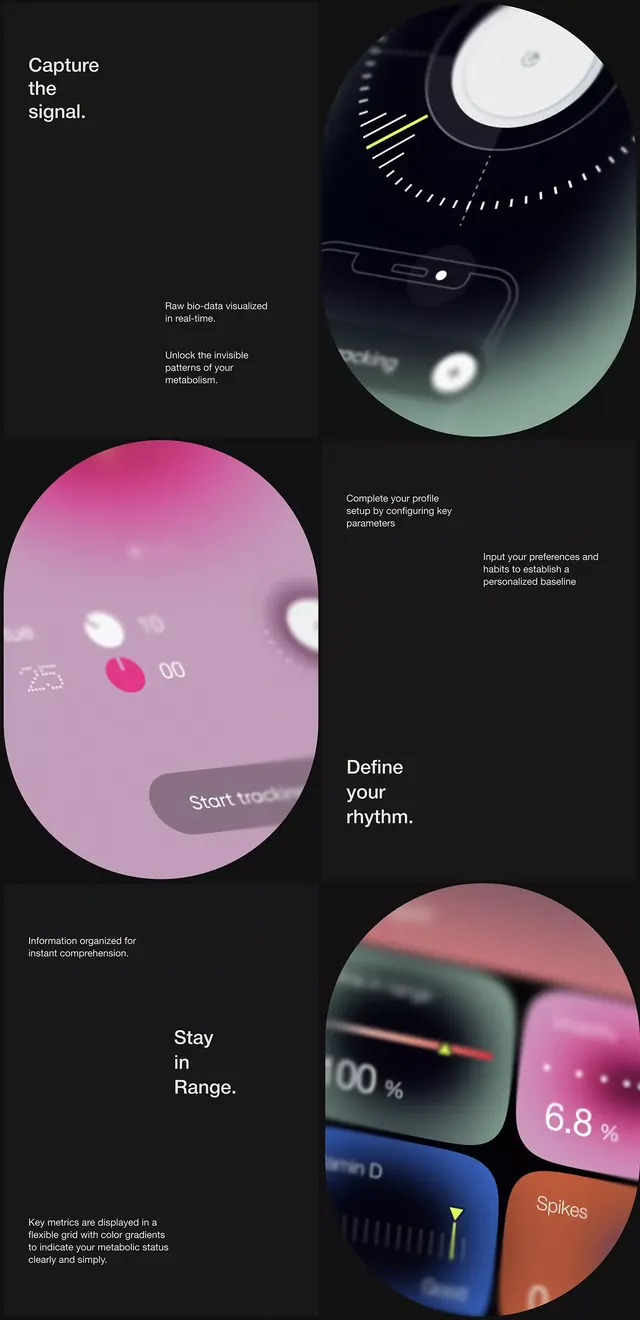
A multi-screen app interface mockup using circular gauge elements and gradient overlays in pink, teal, and dark tones to visualize personal health metrics in real time.
Summary
A multi-screen app interface mockup using circular gauge elements and gradient overlays in pink, teal, and dark tones to visualize personal health metrics in real time.
Visual description
A vertical-scroll mockup displays three distinct interface screens stacked asymmetrically on a dark background. Circular orbital UI elements dominate each screen: a teal-and-navy gauge in the upper third showing data with white accent points and subtle dashed rings; a large pink circular element in the middle with soft gradient transitions to lavender, displaying interface controls and numeric readouts; a smaller amber-orange circular segment at the bottom showing percentage-based metrics. Text is white and light gray, set in clean sans-serif, positioned to the left and right of the circular forms. Soft light halos around each circular element suggest depth and glow, while gradient transitions from pink through teal to dark charcoal create a luxurious, modern aesthetic.
Key takeaway
The use of circular gauges as a primary data-visualization metaphor for wellness/health tracking. The restraint in typography and layout, letting the colorful circular forms dominate visual hierarchy. The subtle gradient and glow effects that make flat shapes feel dimensional without heavy 3D rendering.
Reuse notes
Ideal for health, fitness, or wearable-data apps targeting premium/wellness markets. The color palette (pink/teal/dark) feels current but not overly trendy. Works well on mobile screens in portrait mode. The circular gauge pattern is intuitive for at-a-glance metric scanning, making it suitable for dashboard or summary screens.
More like this




Keep what you find
A free account saves references to boards and can send you a weekly email of picks based on what you save.
To see every result, go Pro.