Preview image. Unlock full-res
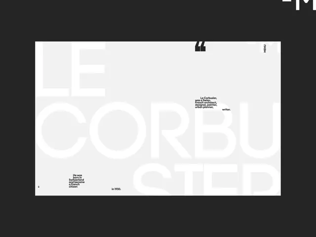
Biographical editorial layout featuring Le Corbusier with oversized sans-serif type, minimal layout hierarchy, and monochromatic contrast.
Summary
Biographical editorial layout for Le Corbusier with oversized sans-serif type, a large quotation mark, minimal grid composition, and biographical snippets scattered asymmetrically.
Visual description
Light beige background with a vertical sidebar on the left containing navigation elements (menu, archive, support). Large white-outlined CORBU letterforms dominate the center, overlaid with small black sans-serif biographical text: "He was a Swiss, French architect, designer, painter, urban planner, writer." A large double-quotation mark in black appears top-right. Lower left corner contains smaller biographical copy: "He was born in Switzerland and became a French citizen in 1930." A narrow vertical menu label "MENU" appears on the far right edge.
Key takeaway
The generous use of white space and the interplay between oversized letterforms and small-scale supporting text creates visual hierarchy without visual clutter. The asymmetric positioning of biographical snippets gives direction to the layout. The single large quotation mark serves as both punctuation and visual anchor.
Reuse notes
Works well for academic, historical, or institutional editorial contexts. The light background and minimal color palette suits projects requiring a professional, scholarly tone. Pairs naturally with archival or biographical content. Avoid on small screens or when densely layered imagery is needed.
More like this



Keep what you find
A free account saves references to boards and can send you a weekly email of picks based on what you save.
To see every result, go Pro.