Preview image. Unlock full-res
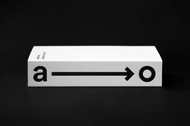
Minimalist monochrome physical object with lowercase letters "a" and "o" connected by a bold directional arrow.
Summary
A stark black and white graphic design object featuring lowercase letters "a" and "o" separated by a bold directional arrow on a clean white platform against pure black background.
Visual description
Pure black void background contrasts with a white rectangular form displaying the conceptual composition. Black sans-serif letterforms "a" and "o" are positioned at the left and right with a thick black arrow pointing rightward between them, suggesting direction or relationship. Minimalist three-dimensional perspective visible in the form's edges. Small text visible on the top left edge. Crisp geometric treatment and high-contrast monochromatic palette emphasize conceptual clarity. Clean, disciplined design execution.
Key takeaway
The power of directional arrows and spatial relationships to create narrative meaning from minimal elements. The connection between two letters via an arrow suggests process, flow, or transformation. The pure monochromatic treatment and Swiss-style geometry convey intellectual rigor and contemporary design thinking.
Reuse notes
Strong reference for conceptual graphic design, design studio branding, or process visualization. The arrow as a connector works well for showing workflows, relationships, or paired concepts. The monochromatic presentation is effective for print, signage, or exhibition contexts. The clean geometric execution translates well across scale and media. Suitable for design education, studio portfolios, or contemporary branding contexts.
More like this

Keep what you find
A free account saves references to boards and can send you a weekly email of picks based on what you save.
To see every result, go Pro.