Preview image. Unlock full-res
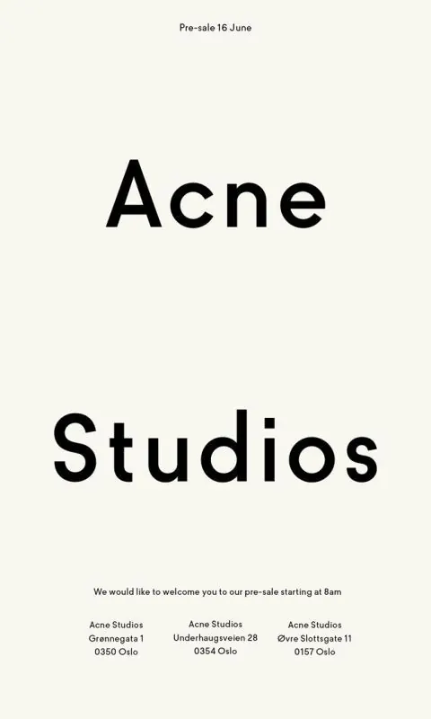
Minimalist pre-sale announcement for Acne Studios with hierarchical typography and location details on warm cream background.
Summary
Minimalist pre-sale announcement for Acne Studios with hierarchical typography and location details on warm cream background.
Visual description
Cream-white background with black sans-serif typography anchoring the composition. "Pre-sale 16 June" appears in small text at the top. Two oversized words "Acne Studios" dominate the center in bold, spaced display typeface, taking up roughly 60% of the composition's height. Below, a brief line of body copy in regular weight explains the event. At bottom, three columns list address information for three Oslo locations: Gronnegata 1, Underhaugvelen 28, and Ovre Slottsgata 11. All text aligns left with consistent spacing and weight hierarchy.
Key takeaway
The stark simplicity of a two-weight type system (display + body) doing all the work. The three-column address block at bottom is scannable without ornament or visual separators, just consistent alignment and breathing room.
Reuse notes
Works well for retail pre-launch announcements, gallery hours, or any institutional multi-location announcement. The cream-to-black palette reads premium and high-end. Spacing is generous, making it suitable for both poster and print applications.
More like this



Keep what you find
A free account saves references to boards and can send you a weekly email of picks based on what you save.
To see every result, go Pro.