Preview image. Unlock full-res
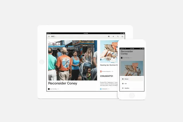
A mockup featuring a tablet and a smartphone displaying a responsive website with photographic content and text.
Summary
A mockup featuring a tablet and a smartphone displaying a responsive website with photographic content and text.
Visual description
The image shows a white tablet and a white smartphone centered against a light gray background. The screens display a website with a large photograph of people in a street setting, the heading 'Reconsider Coney', and a sidebar with social media handles like '@MoMAPS1'.
Key takeaway
Use device mockups to demonstrate how a responsive web layout adapts across different screen sizes.
Reuse notes
Use this when presenting a new website design or mobile app interface in a portfolio or pitch deck.