Preview image. Unlock full-res
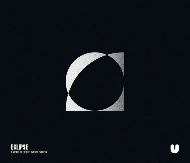
A dark, grainy abstract composition shows overlapping white geometric shapes forming an eclipse-like symbol with small typography in the bottom corners.
Summary
A dark, grainy abstract composition shows overlapping white geometric shapes forming an eclipse-like symbol with small typography in the bottom corners.
Visual description
The image is a full-bleed black field with subtle grain and a centered abstract white geometric mark made from a circle and square overlap. In the bottom left there is the word ECLIPSE with a smaller subtitle beneath it, and a small white rounded logo mark sits in the bottom right.
Key takeaway
Use simple overlapping geometry to create a symbol that feels more complex than its parts. Pair it with heavy negative space and grain to give a minimal composition more presence.
Reuse notes
Reach for this when you want a brand poster, cover, or identity study that needs to feel editorial and iconic without relying on illustration. It works best for monochrome systems where texture and shape do the visual work.