Preview image. Unlock full-res
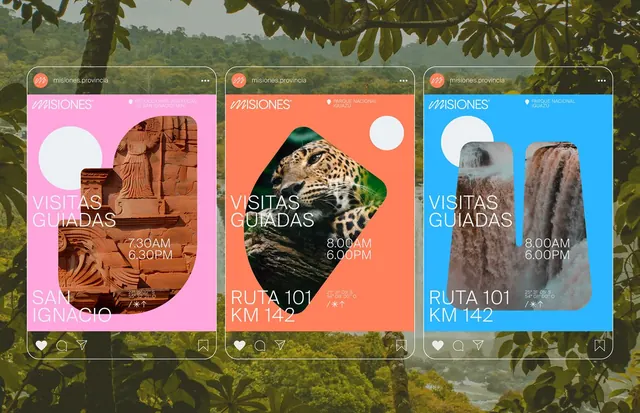
Travel marketing social cards in bold pink, coral, and blue, each card pairs a circular cropped nature image with white sans-serif type and Spanish copy.
Summary
Three portrait social cards in saturated pink, coral, and bright blue, each framing a round cropped nature photograph with bold sans-serif type and Spanish place names.
Visual description
Three vertical cards arranged side by side, each 16:9 or taller. Left card: hot pink background, a wood carving in a circular crop top-right, white sans-serif headline "VISITAS GUIADAS", handwritten cursive "SAN IGNACIO", time stamps "7:30AM 6:30PM" in white. Center card: coral-orange background, a leopard face in circular crop top-left, white heading and route "RUTA 101 KM 142" with hour tags. Right card: bright cyan-blue background, weathered tree bark or root in circular crop top-right, same heading + "RUTA 101 KM 142". All three cards float over a background of lush forest greenery, visible between them, suggesting nature tourism. White circle accents sit opposite the images on each card for visual balance. Instagram-style chrome (heart, comment, share icons) visible at the bottom of each.
Key takeaway
The bold monocolor card backgrounds (hot pink, coral, bright blue) create instant visual rhythm and social-media stopping power without layering gradients. The circular image crops sit in asymmetric positions, anchored by a white dot on the opposite corner, creating dynamic composition within a static portrait frame. The mix of display-weight Spanish headings, smaller time/route info, and a signature cursive line establishes hierarchy and character in minimal space.
Reuse notes
Strong for travel, tourism, or adventure-brand social feeds. Each card is self-contained and scrolls well on mobile feeds. Works best when the images are vibrant nature or cultural assets (not portraits or subtle tones). Keep the color contrast high or the type will lose legibility.
More like this







Keep what you find
A free account saves references to boards and can send you a weekly email of picks based on what you save.
To see every result, go Pro.