Preview image. Unlock full-res
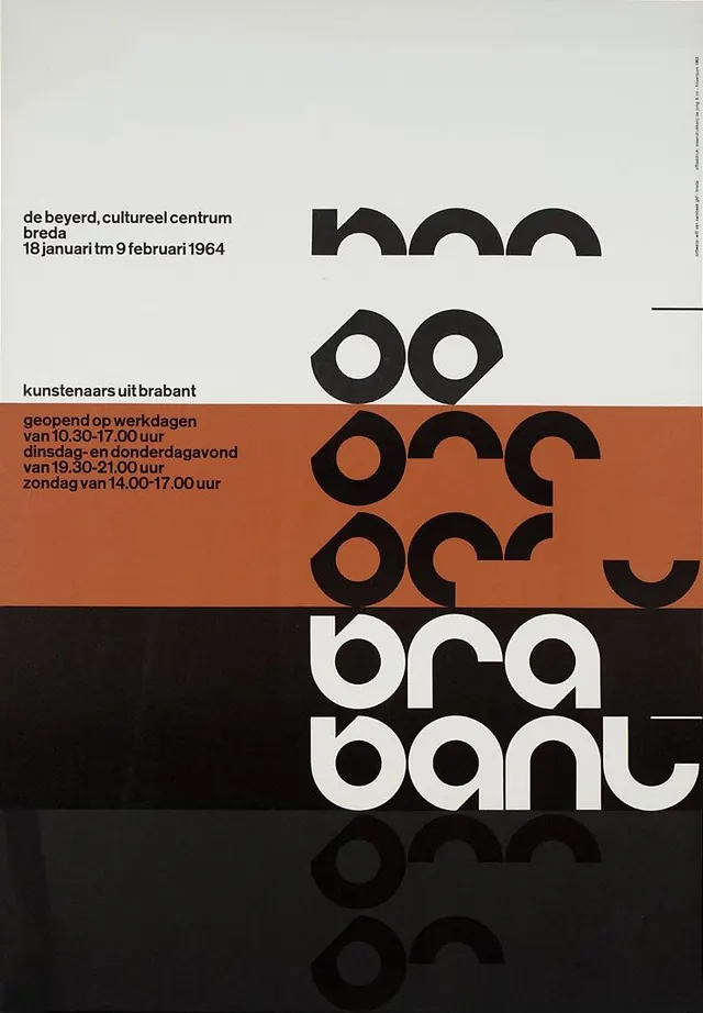
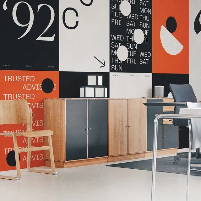
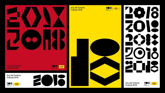
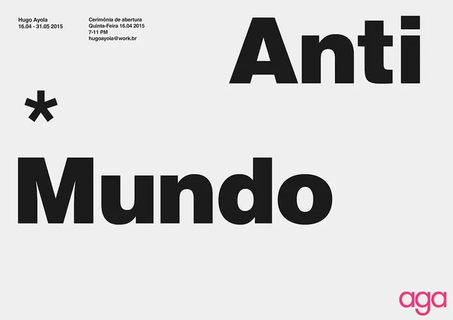
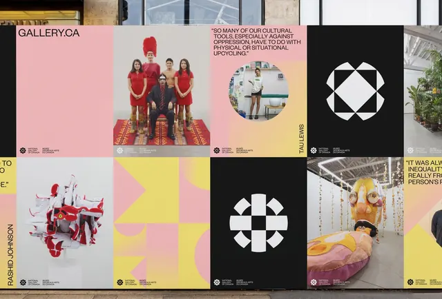
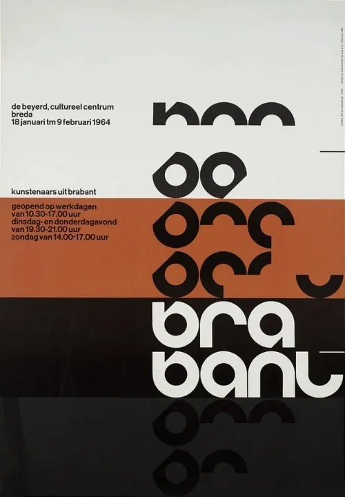
A typographic exhibition poster featuring highly stylized, geometric letterforms and a color-blocked layout.
Summary
A typographic exhibition poster featuring highly stylized, geometric letterforms and a color-blocked layout.
Visual description
The design uses large, abstract geometric shapes that function as both letters and patterns, stacked in horizontal bands of white, terracotta, and black. Text is arranged in a clean, left-aligned block on the upper left, while oversized, distorted letterforms dominate the right and bottom sections. The composition relies on high contrast and a strict grid-like division of color.
Key takeaway
Use extreme typographic abstraction where letterforms become geometric patterns to create visual interest while maintaining a structured layout.
Reuse notes
Ideal for cultural event posters, art exhibition branding, or avant-garde editorial covers.