Preview image. Unlock full-res
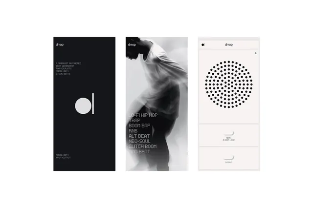
A three-panel layout featuring a dark-mode wordmark, a high-contrast black and white photograph, and a light-mode typographic layout with a geometric dot pattern.
Summary
A three-panel layout featuring a dark-mode wordmark, a high-contrast black and white photograph, and a light-mode typographic layout with a geometric dot pattern.
Visual description
The design uses a stark black and white palette across three distinct layouts. It features a bold wordmark with a circular graphic, a grainy black and white portrait, and a clean layout with a large circular dot grid.
Key takeaway
The design demonstrates how to balance high-contrast imagery with structured, minimalist typography to create a premium aesthetic.
Reuse notes
Apply the dot-grid pattern and high-contrast monochrome palette to editorial layouts or brand identity systems.
More like this



Keep what you find
A free account saves references to boards and can send you a weekly email of picks based on what you save.
To see every result, go Pro.