Preview image. Unlock full-res
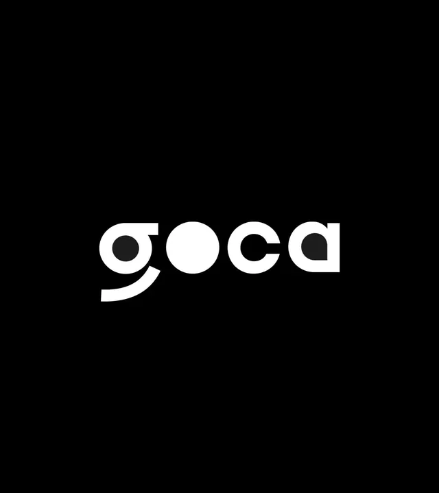
Bold wordmark for Goca set in a geometric sans-serif with a full circular void cut through the second letter, creating a negative-space icon.
Summary
Bold wordmark for Goca in a geometric sans-serif with a full circular void cut through the second letter, creating a striking negative-space mark.
Visual description
Pure black background with a centered white wordmark reading "goca" in a geometric, rounded sans-serif. The second letter (o) is a complete circle cutout, leaving the background visible, which doubles as a geometric icon within the letterforms. The letterforms are generous and fully enclosed, giving the mark substantial weight and legibility despite the void.
Key takeaway
The circular cutout as a dual-purpose design move: it functions as both a literal void in the wordmark and as a distinct icon. This integration of mark and cutout makes the logo memorable and compact without needing a separate symbol.
Reuse notes
Strong template for tech, productivity, or design-tool branding where geometric precision signals modernity. The monochromatic treatment is infinitely reproducible across applications. Works at any scale because the void is clean and unambiguous.
More like this




Keep what you find
A free account saves references to boards and can send you a weekly email of picks based on what you save.
To see every result, go Pro.