Preview image. Unlock full-res
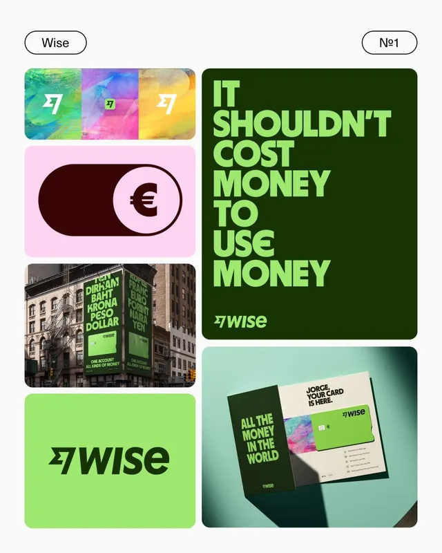
Wise fintech brand identity system with lime-green bold typography, dark green background, and vibrant gradient accent modules showcasing logo, product mockup, and outdoor billboard placement.
Summary
Wise fintech brand identity system with lime-green bold typography, dark green background, and vibrant gradient accent modules showcasing logo, product mockup, and outdoor billboard placement.
Visual description
A multi-format brand showcase arranged in a vertical composition. Top: three colorful gradient squares (green, purple, yellow) each labeled "27" in white, stacked side by side. Middle left: a pink rounded-rectangle toggle switch with a euro symbol in dark brown, used as a product UI component. Middle bottom: full-bleed photograph of a dark green and lime-green billboard mounted on a historic building facade with white sans-serif copy. Right side: large dark green rectangle with "IT SHOULDN'T COST MONEY TO USE MONEY" in bold lime-green all-caps, the Wise logo mark below in white. Bottom: mint-green mockup showing folded business cards and collateral with the brand's gradient accent colors. The palette uses the lime-green (about #9EE86F) as the primary accent against dark forest green (#173300), with supporting hot pink, cyan, and yellow gradients across the modular cards.
Key takeaway
The strategic use of a single vibrant accent color (lime-green) against a dark forest-green base to create high contrast and modern energy; the modular gradient cards that build a cohesive visual language across touchpoints; the bold all-caps san-serif typography paired with short, punchy copy for fintech messaging that avoids jargon.
Reuse notes
Ideal for fintech, payments, or financial-services brands targeting a younger, tech-savvy audience. The bold color contrast and playful gradient system translate well to websites, apps, and OOH advertising. Works especially well when the brand needs to convey both trustworthiness (dark green) and innovation (neon accent). Scale the lime-green accent carefully to avoid oversaturation in digital contexts.
More like this



Keep what you find
A free account saves references to boards and can send you a weekly email of picks based on what you save.
To see every result, go Pro.